Basics
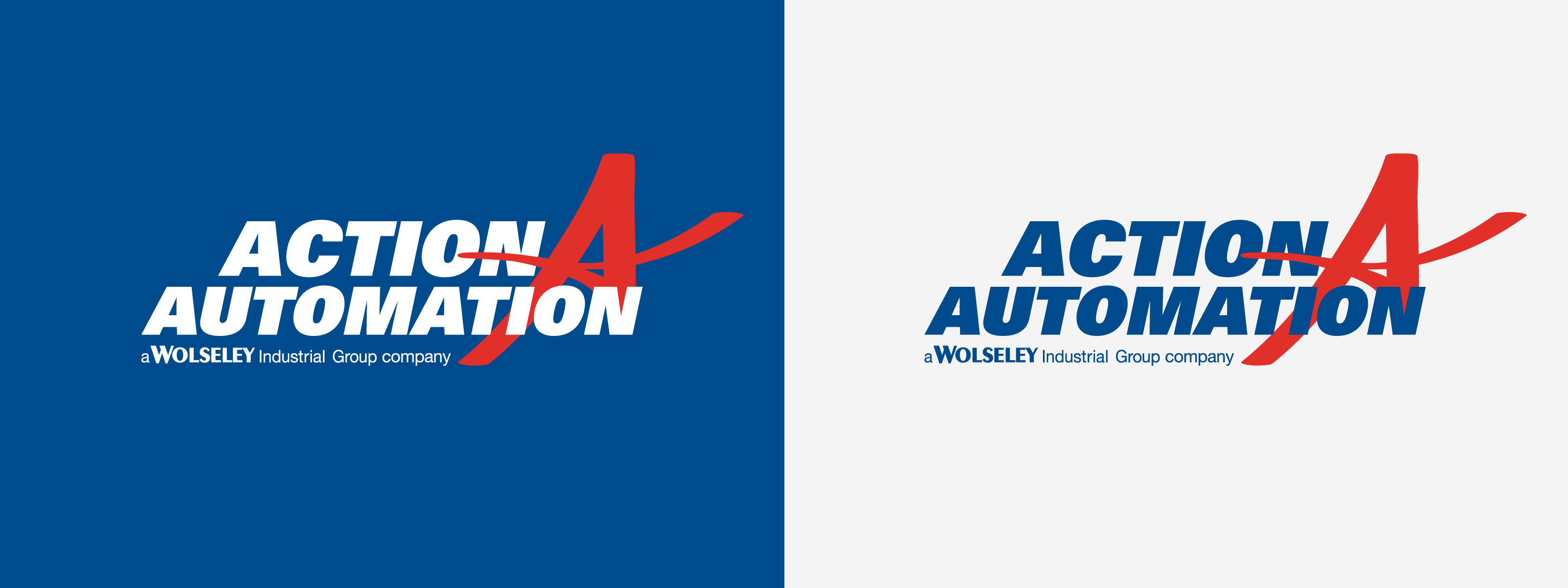
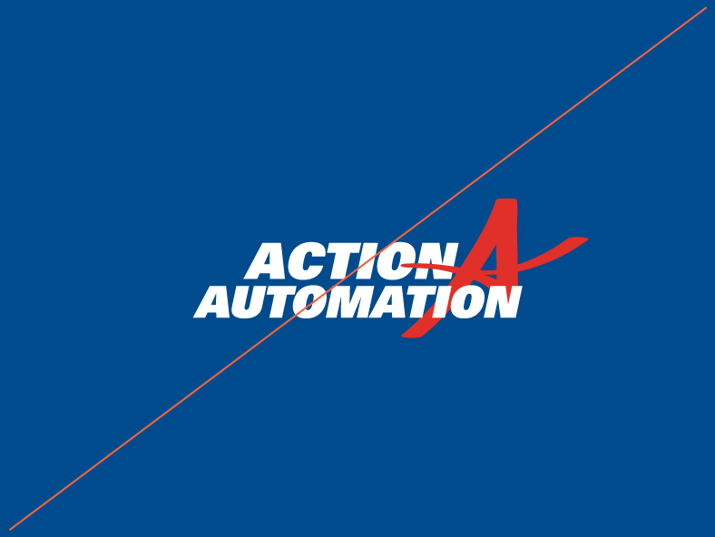
On dark backgrounds use logos with light text.
On light backgrounds use logos with dark text.
Last Updated March 6, 2019
On dark backgrounds use logos with light text.
On light backgrounds use logos with dark text.
Our logo should always be placed consistently so that it is easy to find. Start by ensuring appropriate space around the logo–it should never be lost amongst other logos or graphics. Following these minimum clear space guidelines will ensure clarity and legibility of our mark.
The logo should be placed at least an A’s worth of space from other elements.
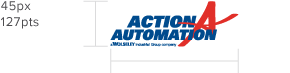
For small spaces, be sure not to use the logo or icon at dimensions smaller than the specified minimum sizes.
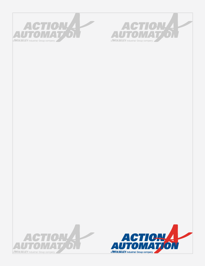
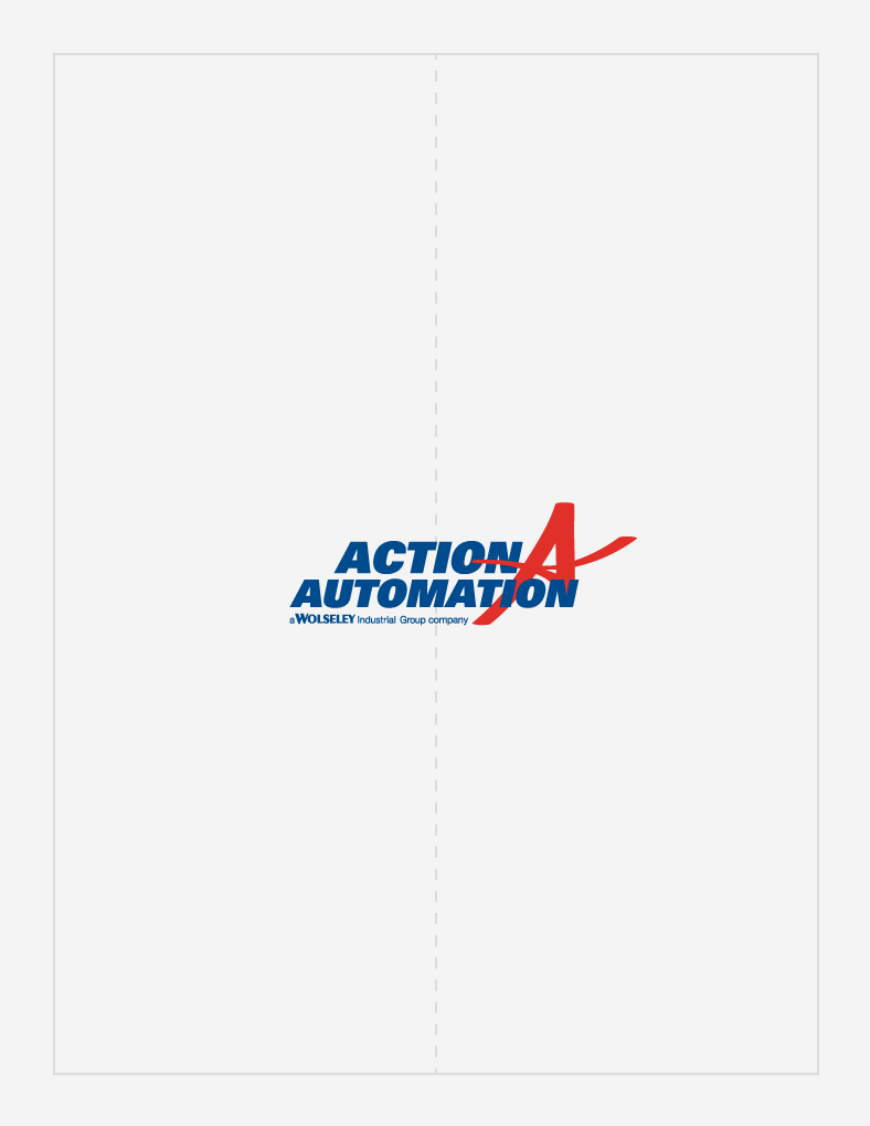
Place our logo in one of the four corners or center it on a page. In both cases, it is aligned against the margin.
As a general rule, only use the approved and provided logos. Thanks for not embellishing on the logo with shadows, patterns, intricate backgrounds, or elaborate effects.
Don't change the colors.
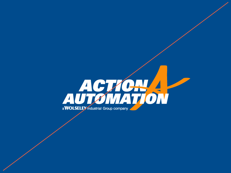
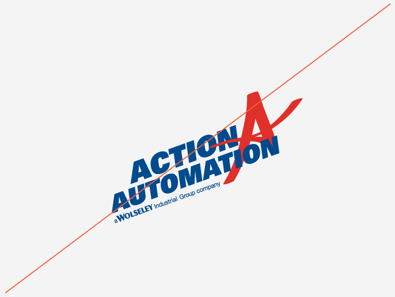
Don't tilt or rotate.
Don't skew or stretch.
Don't use different fonts or re-typset.
Don't use on backgrounds with insufficient contrast.
Don't rearrange.
Don't remove "a Wolseley Industrial Group company".
When creating or printing a piece, be sure to double check the colors you are using. Remember, different mediums require different color values, color proportions matter, and some colors are used for specific types of content only.
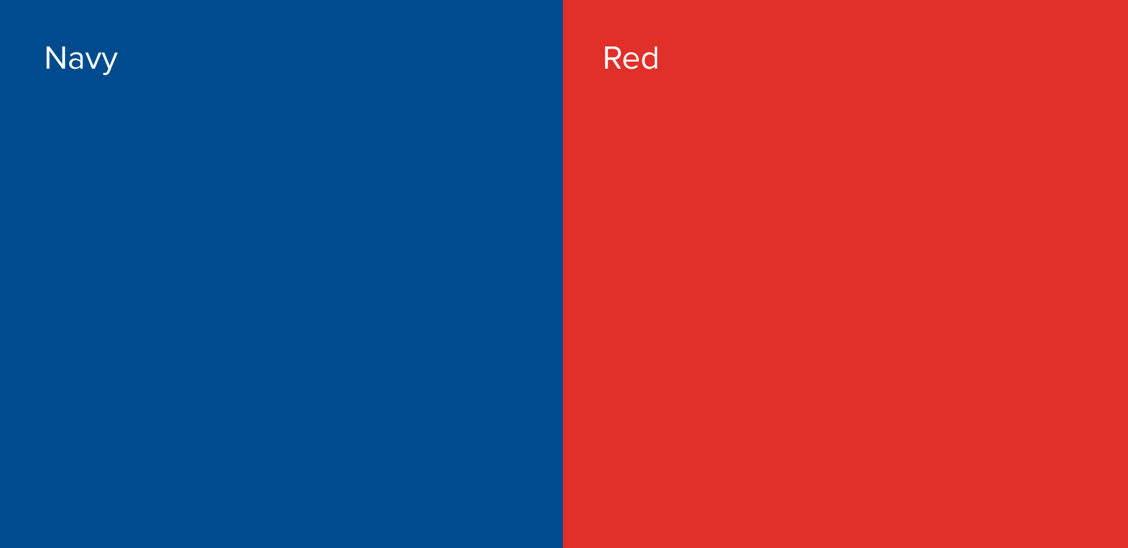
Our primary colors are navy and red. Be consistent by using the specified values of these colors so that all of our communications are cohesive and recognizable.
When color consistency is imperative, use Pantone values. Coated (C) values are for glossy paper and uncoated (U) values for matte paper.
For general printing, use CMYK. This is often more economical than Pantone.
In digital contexts, like websites and projections, use RGB & Hex values.
Pantone
287
CMYK
100 79 16 3
RGB
0 75 141
Hex
#004b8d
Pantone
1797
CMYK
0 100 90 0
RGB
237 27 47
Hex
#cb333b
Red is our action color. It is used sparingly to highlight action. For example, phone numbers, pushers, and links.
The fonts we use and the way we place our content helps our customers and employees sort through information. Adhering to our typography rules will make it easier for people to understand our messages and find what they are looking for.
Proxima Nova is our brand typeface. There are some limitations when it comes to using our brand typefaces on digital platforms, like emails, e-newsletters, and email signatures.
Whenever you are unable to use Proxima Nova, use Arial.
Proxima Nova regular—AaBbCcDdEeFfGgHhIiJjKkLlMmNnOoPpQqRrSsTtUuVvWwXxYyZz
0123456789.,;:(?&@$#)\
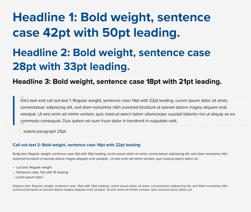
The size of our font will vary across applications, but here are some general rules.
Headlines are best set at 18pt or larger. They should be noticeably bigger than body text. Headlines will be the largest text in a composition. They should be short and important. All headlines that are statements should be formatted in sentence case (capitalizing only the first word and ending with punctuation).
Body text is best set between 11pt and 16pt, with care given to legibility. There should be a generous amount of spacing between each of the lines (also known as leading).
Lists are set at the same size as body text. Bullets are indicated with a single en-dash.
Captions and fine print are the smallest texts in a composition.
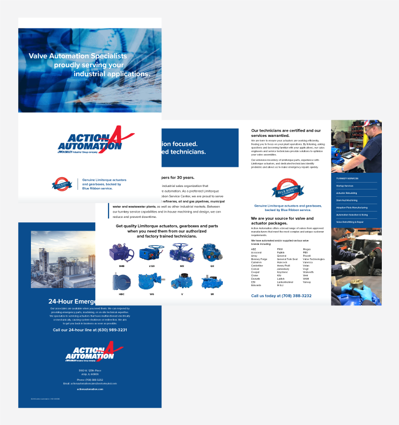
Here are the key assets to the Action Automation brand. Whether it is your first time reviewing this Brand Suitcase or the 30th, it is always smart to revisit the rules and recommendations for the specific files you are downloading. Keep in mind, this platform will continually be updated as the brand progresses — so be sure to check back with each new project.