Logos are key brand identifiers — that is why it is imperative that ours is always presented in a consistent way. Learn how properly place and size our logo. All logo assets can be accessed in the Asset Downloads.
Basics
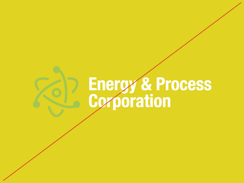
On dark backgrounds, use logos with light text to ensure maximum contrast and visibility.
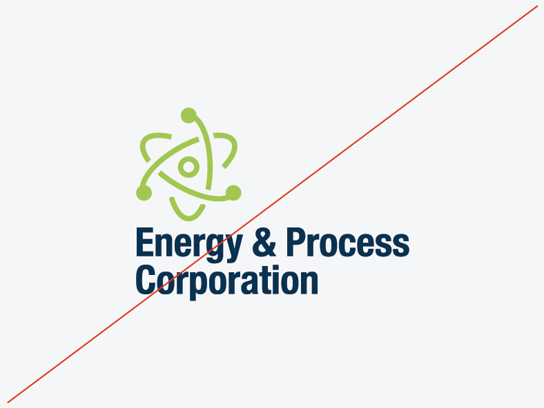
On light backgrounds, use logos with dark text to ensure maximum contrast and visibility.
Use the icon in secondary situations, or when space is limited.
Our Logo
Our Icon
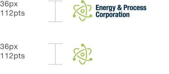
Clear Space and Minimum Sizes
Your logo should always be placed consistently so that it is easy to find. Start by ensuring appropriate space around the logo—it should never be lost amongst other logos or graphics. Following these minimum clear space guidelines will ensure clarity and legibility of your mark.
Keep at least an Es worth of negative space between the logo and other elements.
Keep at least 3 circles worth of negative space between the icon and other elements.
Never use the logo or icon at dimensions smaller than the specified minimum size.
Logo Clear Space
Icon Clear Space
Minimum Sizes
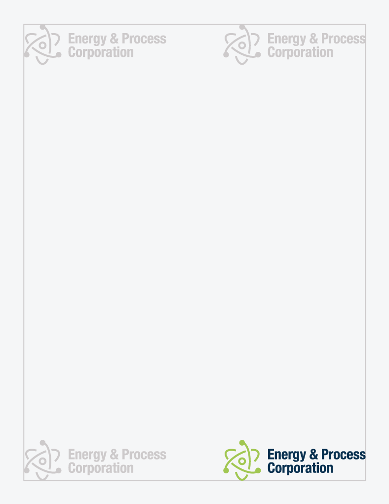
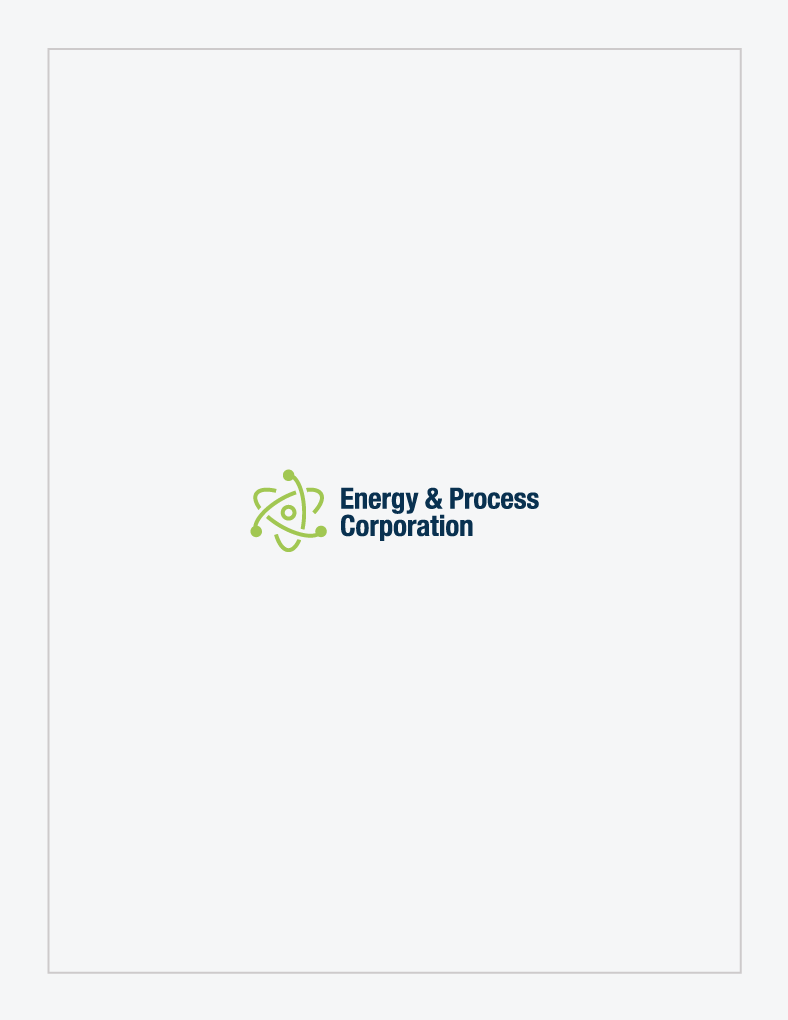
Placement
The logo should either appear in the center of a piece or in one of its four corners.
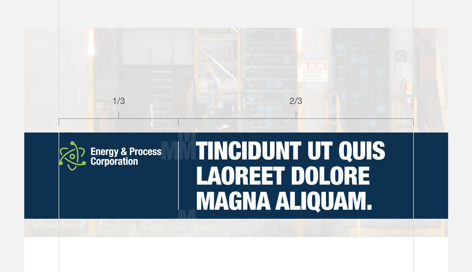
When placed in a header bar, the logo should appear to the left of any type and should account for 1/3 of the bar’s overall width.
These placement rules also apply to the icon.
Corner placement
Central placement
Header bar placement
Logo Don'ts
Don’t change the color of the logo.
Don’t rotate the logo.
Don’t distort the logo.
Don’t re-typeset the logo.
Don’t place on a background with insufficient contrast.
Don’t create additional lock-ups.
Color
When creating or printing a piece, be sure to double check the colors you are using. Remember, different mediums require different color values, color proportions matter, and some colors are used for specific types of content only.
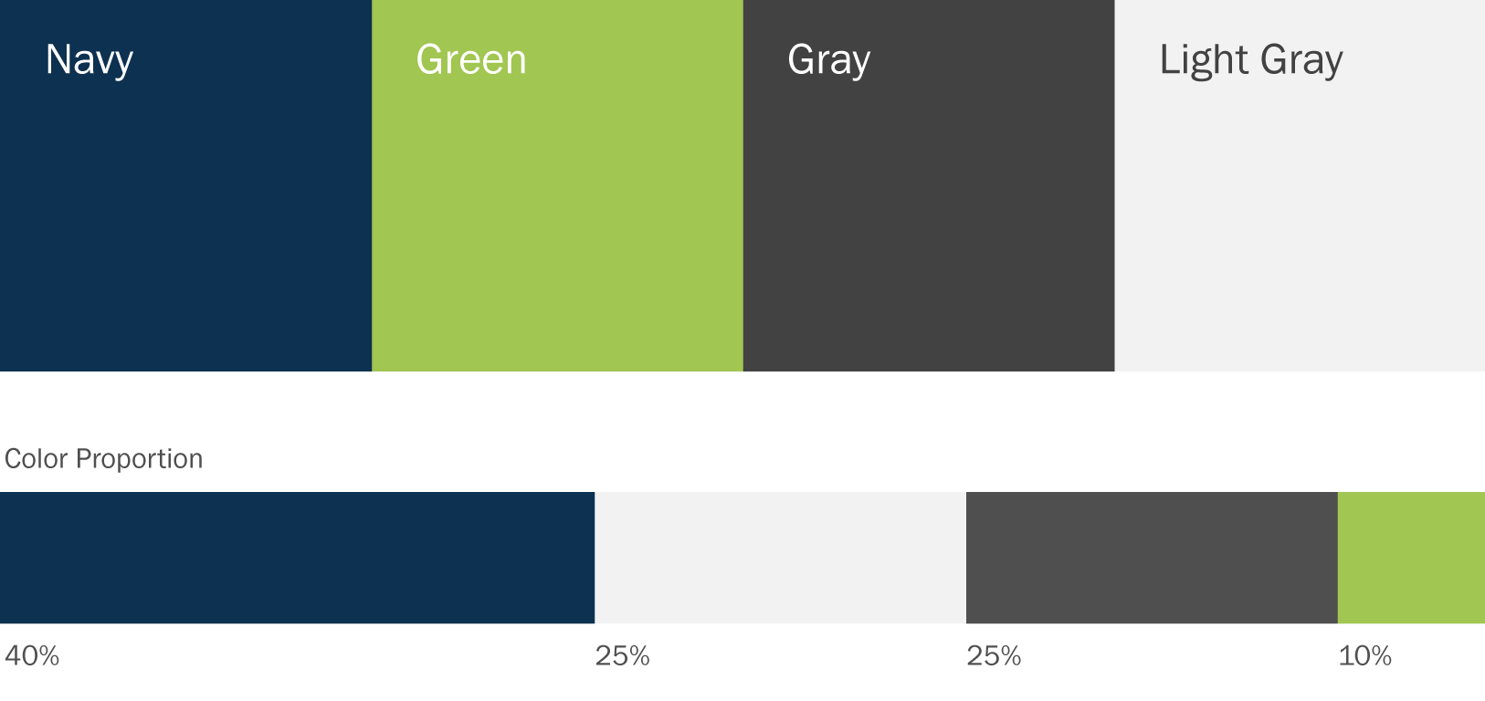
Our color palette consists of a strong, stable navy juxtaposed with a vibrant, energetic lime. Use the specified values to ensure color consistency across all branded materials.
Some colors are meant to be used more sparingly than others. The chart below shows the color relationships in a given brand application. These percentages are not compulsory, they are only provided to give a general idea of recommended proportions.
Swatches
Color consistency across all brand materials is key. Here’s what you need to know:
Use Pantone values when color consistency is imperative. Use coated (C) values for glossy paper and uncoated (U) values for matte paper.
Use CMYK values for typical printing. CMYK is often more economical than Pantone, but can be less consistent across printing processes.
Use RGB & Hex values for digital use like websites, screens, and projection.
The fonts we use and the way we place our content helps our customers and employees sort through information. The more closely we can adhere to our typography rules, the easier it will be for people to understand our messages.
Basics
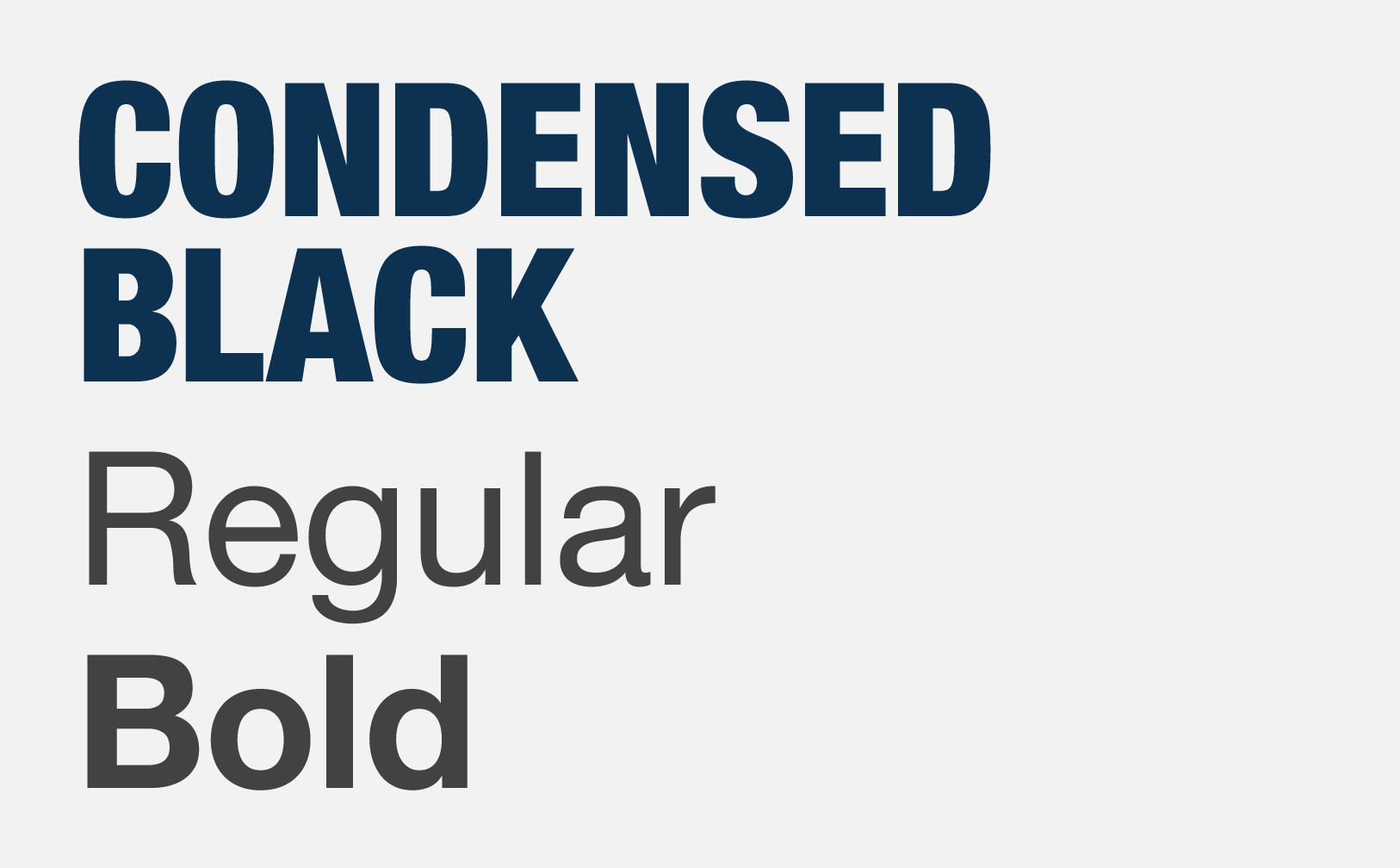
Helvetica Neue is the typeface that should be used on all materials from business cards to signage. Use only this typeface to ensure consistency across all materials.
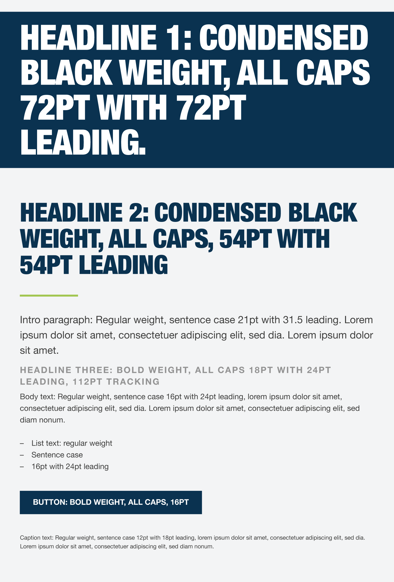
Headline font
Helvetica Neue Condensed Black—AaBbCcDdEeFfGgHhIiJjKkLlMmNnOoPpQqRrSsTtUuVvWwXxYyZz 0123456789.,;:(?&@$#)\
Body font
Helvetica Neue Regular—AaBbCcDdEeFfGgHhIiJjKkLlMmNnOoPpQqRrSsTtUuVvWwXxYyZz 0123456789.,;:(?&@$#)\
Body font with emphasis
Helvetica Neue Bold—AaBbCcDdEeFfGgHhIiJjKkLlMmNnOoPpQqRrSsTtUuVvWwXxYyZz 0123456789.,;:(?&@$#)\
Type Hierarchy
The size of your font will vary across applications, but here are some general rules.
Headlines are best set at 18pt or larger. They should be noticeably bigger than body text. Headlines will be the largest text in a composition. They should be short and important.
Body text is best set between 7pt and 19pt, with care given to legibility. There should be a generous amount of spacing between each of the lines (also known as leading).
Lists are set at the same size as body text. Bullets are indicated with a single en-dash.
Captions and fine print are the smallest texts in a composition. They are used sparingly to annotate imagery or detail legal print at the end of an application. They should be noticeably smaller than the body text.
Sample Settings
Our Websafe Typefaces
There are some limitations when it comes to using your brand typefaces on digital platforms, like emails, e-newsletters, and email signatures.
Whenever you are unable to use Helvetica NeueCondensed Black for headlines, use Arial Bold. Arial regular can be used in place of Helvetica Neue Regular for body text and captions.
These are unique design elements that add flavor and personality to our brand. From photography to icons and artistic details, each element will become a recognizable feature that is associated with who we are. Pay close attention to each asset as they often have different rules for placement.
The grid
Use a grid to organize content clearly, making alignments based off its columns.
Photography
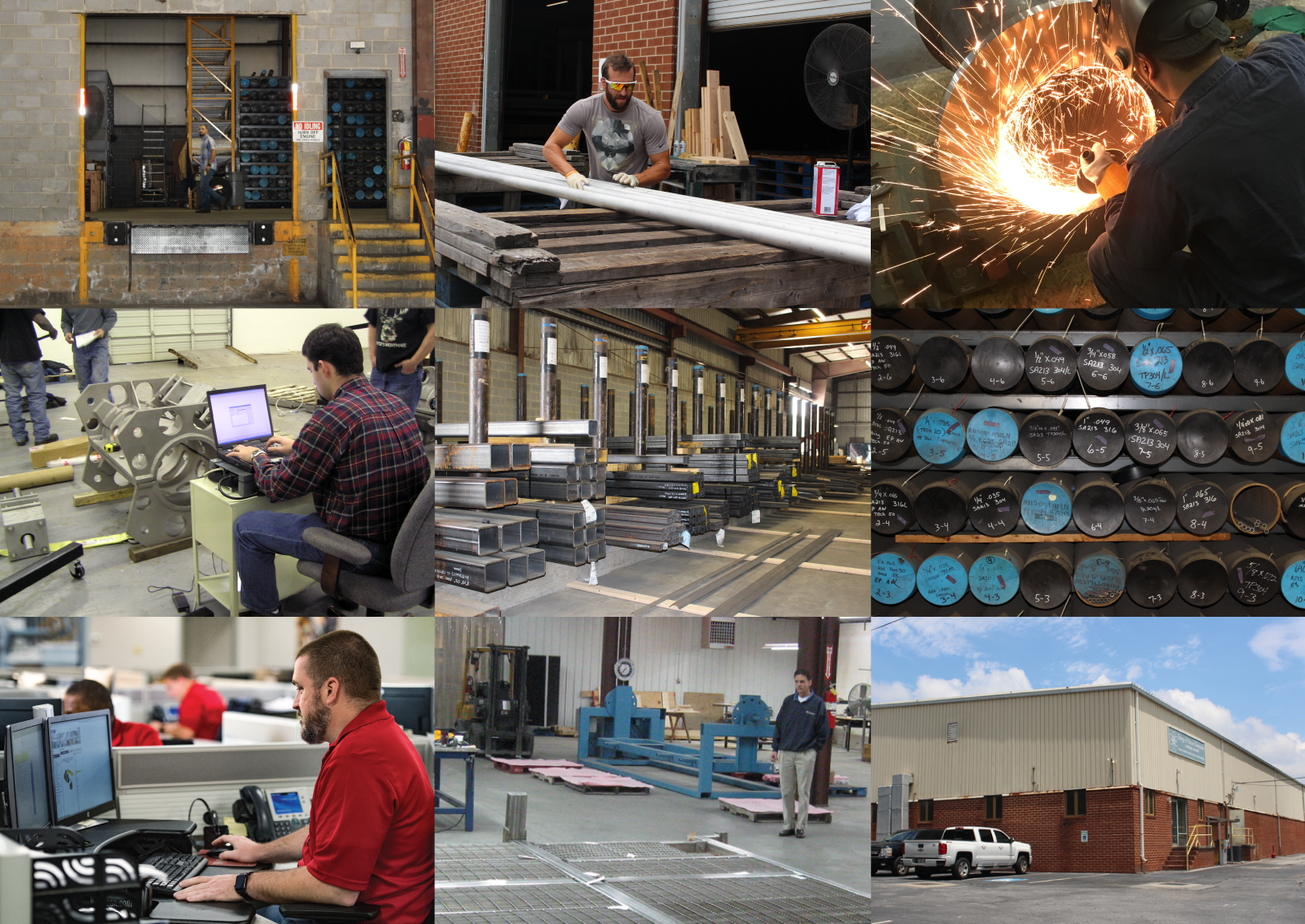
Select images that reinforce our culture of getting it done. Real locations and situations are preferred where subjects are in their natural setting and not looking directly at the camera.
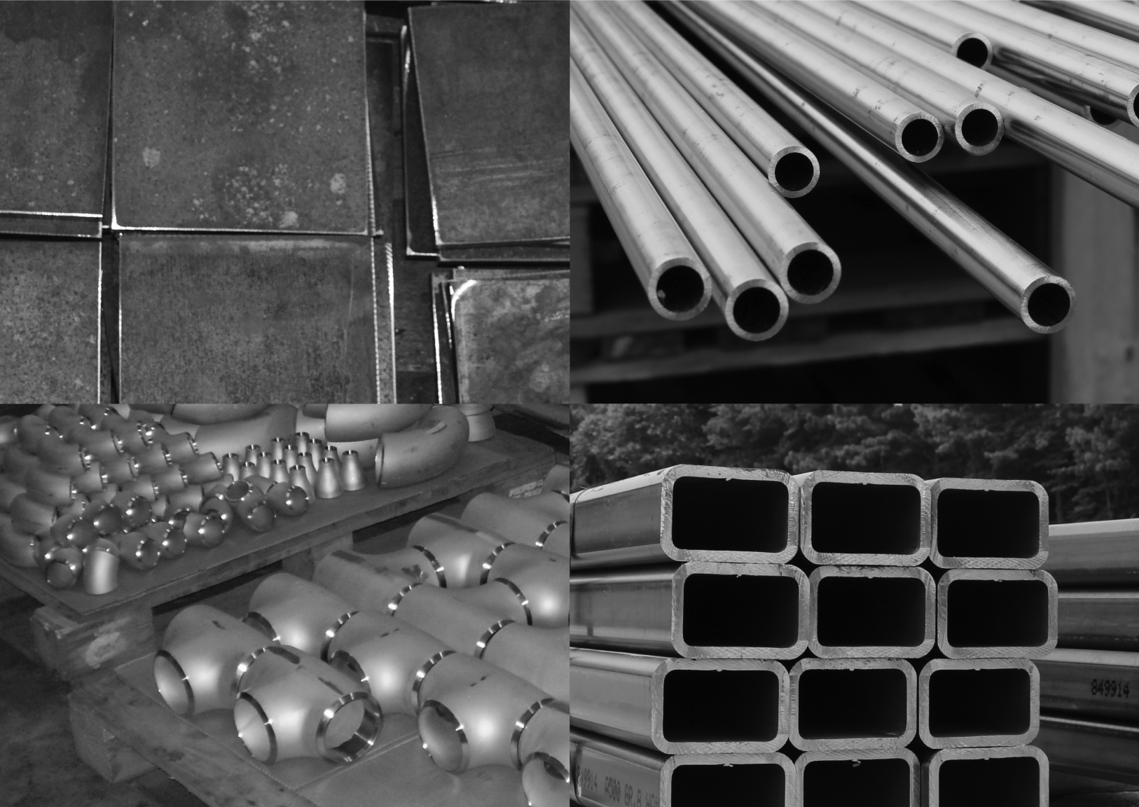
Below you will see two types of example photography, one for lifestyle and one for products. Product photography does not include people, and is always rendered in black and white.
Consider images with a similar depth of field, coloring, and feel as the examples below. Do not use portfolio-style images with subjects looking directly at the camera. Stay away from anything that looks posed or staged.
Lifestyle photography
Product photography
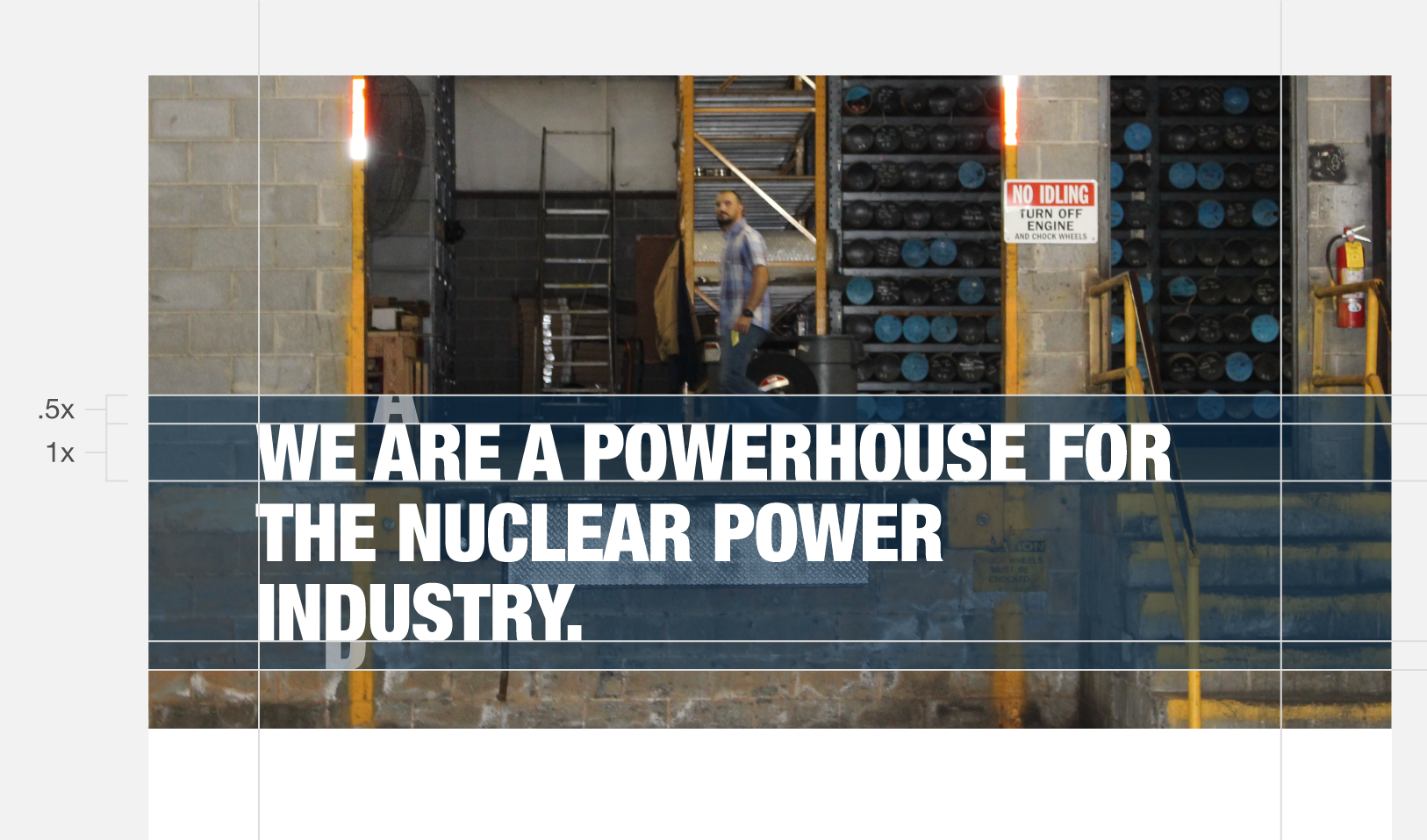
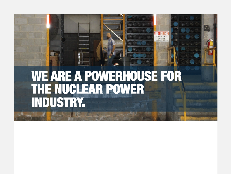
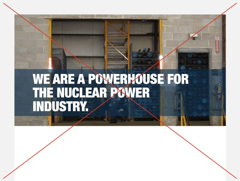
Header Bar
Header bars contain the most important headlines and information. They exist on top of the hero image, and always run off the left and right edges.
When adding a header bar to a hero image, sometimes adjustment to the image is necessary. It’s important to find clear space where the bar can rest comfortably without obstructing any visual elements. Sometimes an image background may need to be extended in order to create this clear space.
Header bar anatomy
Use clear space
Avoid obscuring elements
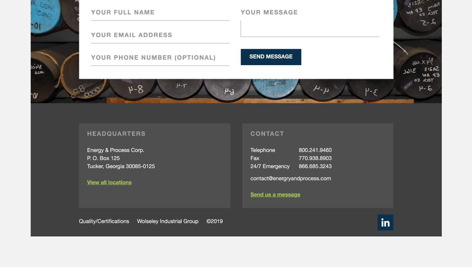
Footer
Use the footer formatting in places like the end of the website and brochures. It should contain supporting content, contact information, and fine print.
Footer example
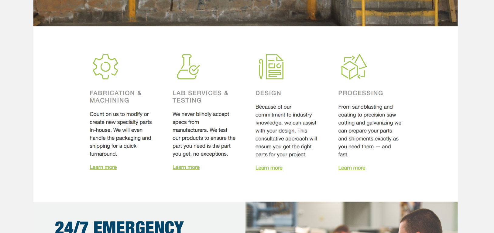
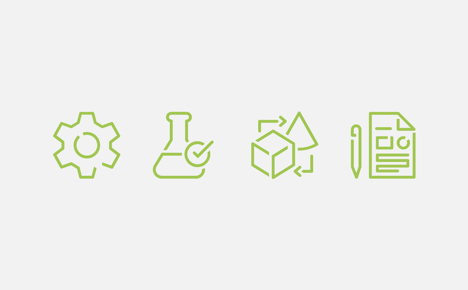
Capabilities Icons
Use these icons whenever you are referring to the four core capabilities.
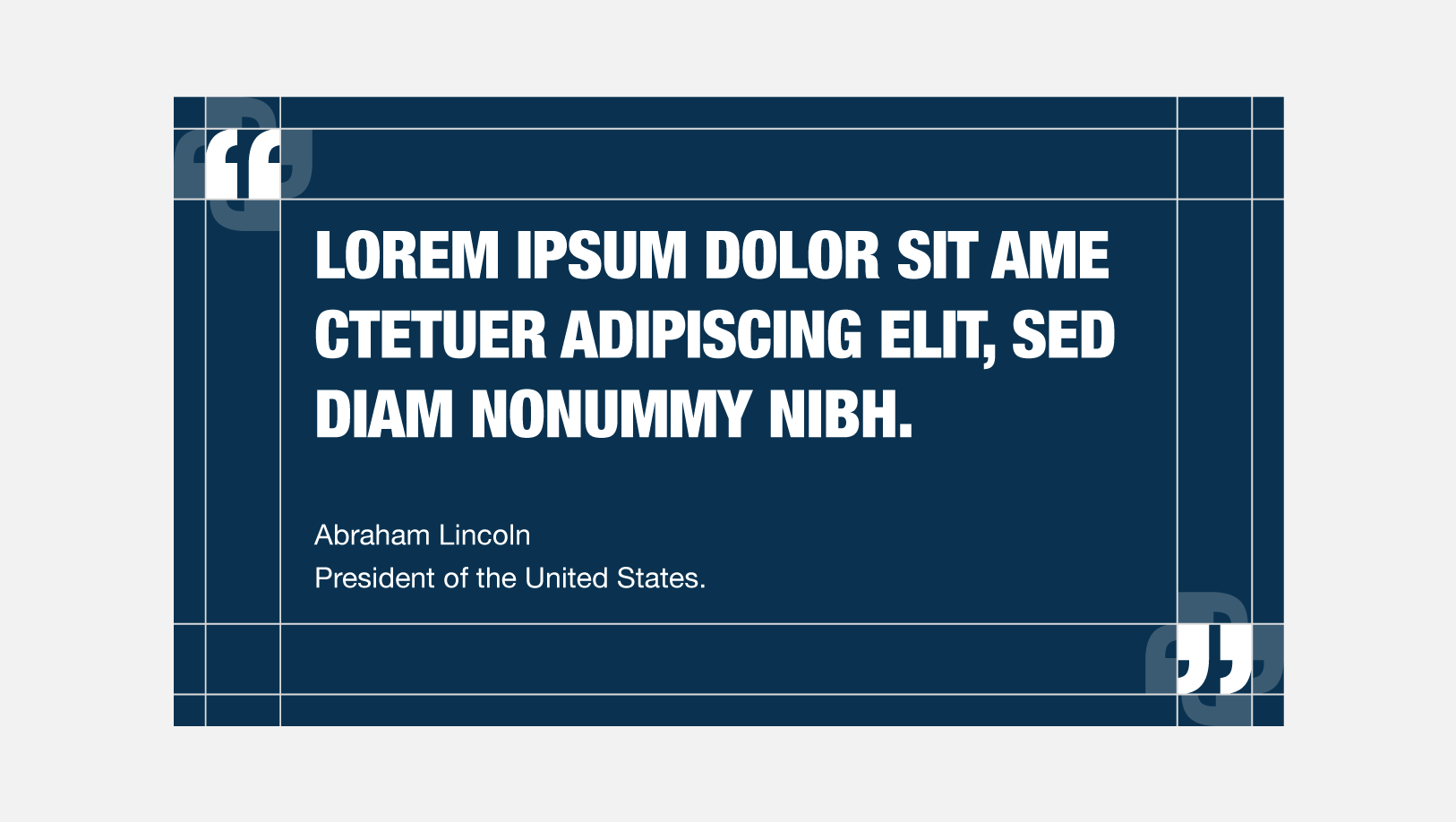
Testimonials
Testimonials always exist inside of blue cards. A quote icon is placed in the upper left and lower right hand corners of the card.
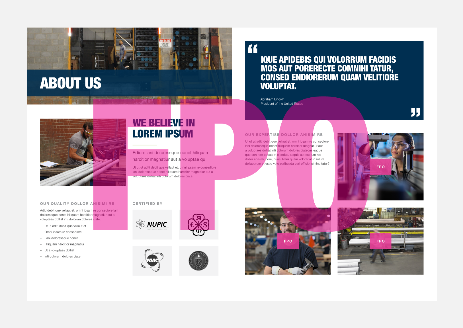
Applications
Below are examples of our visual style in action. In these applications you will be able to see how all of our assets work together to create a cohesive and well positioned brand.
Use these materials as a reference. When creating new applications, try
to arrange type and image in a way that is consistent with the look and feel, as demonstrated below.
Physical Applications
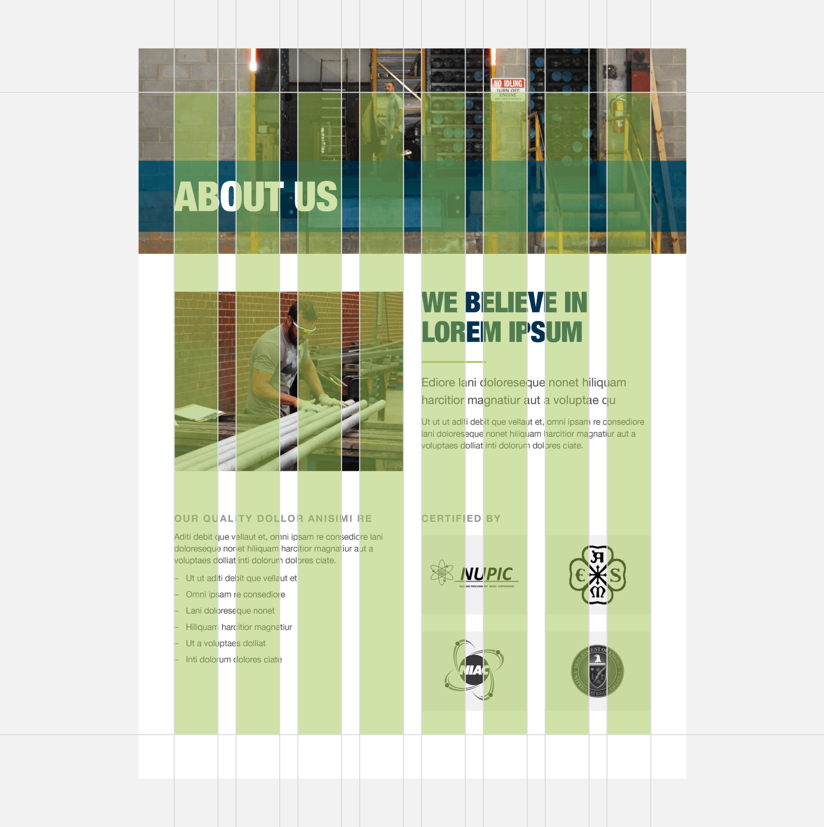
Brochure
Digital Applications
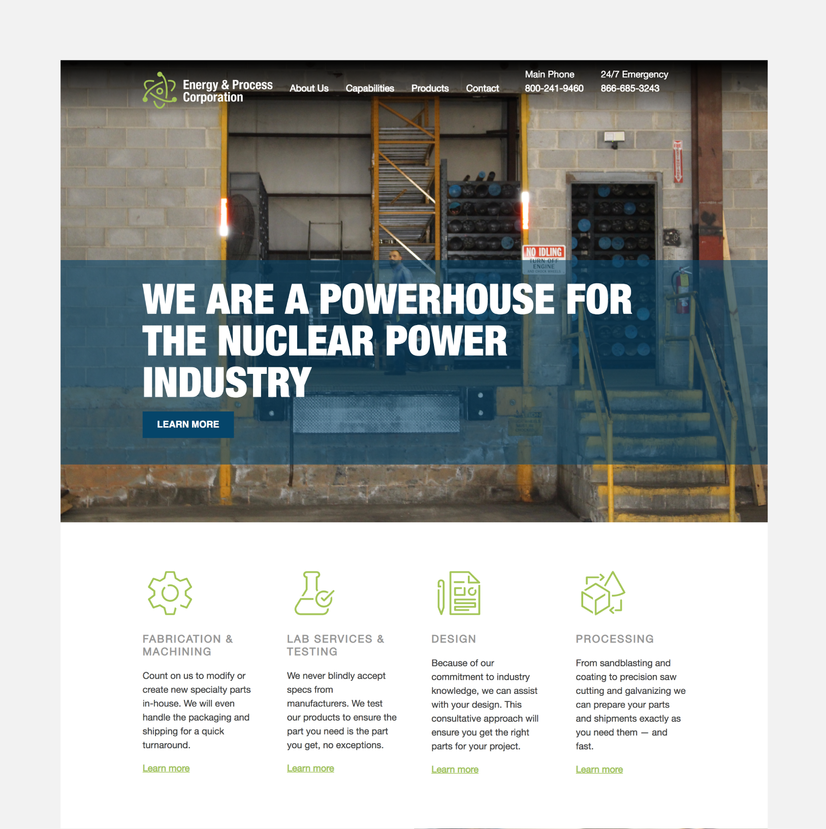
Website
Asset Downloads
Whether it is your first time reviewing this Brand Suitcase or the 132nd, it is always smart to revisit the rules and recommendations for the specific files you are downloading. Keep in mind, this platform will be updated as the brand evolves — so be sure to check back with each new project.

