Outlined here are the foundational messages that keep your company rooted and standing tall.
Brand Essence
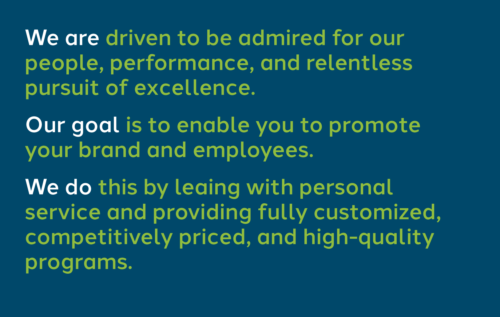
Ukrop’s Threads delivers high-quality uniform and apparel choices to large groups such as food retailers, theme parks and convenience stores. We concentrate on providing custom solutions from start to finish so that customers get the pieces they want, when they want them, without mistakes.
Brand Promise
When customers come to Ukrop’s Threads, they can expect dedicated and personal service from a knowledgeable staff that is pro-active. The client can choose from a wide variety of quality products and/or services (shipping, ordering) related to uniform purchases.
Position
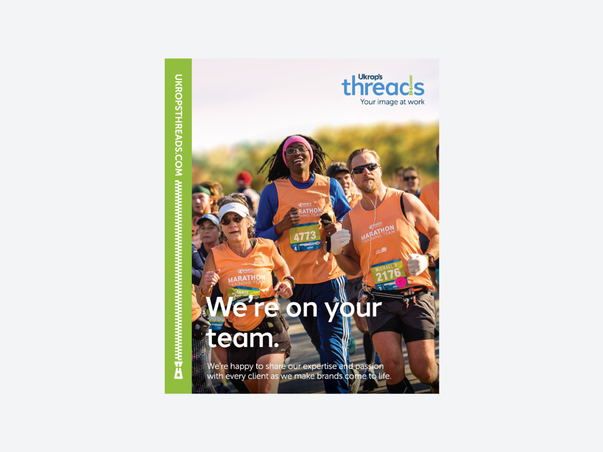
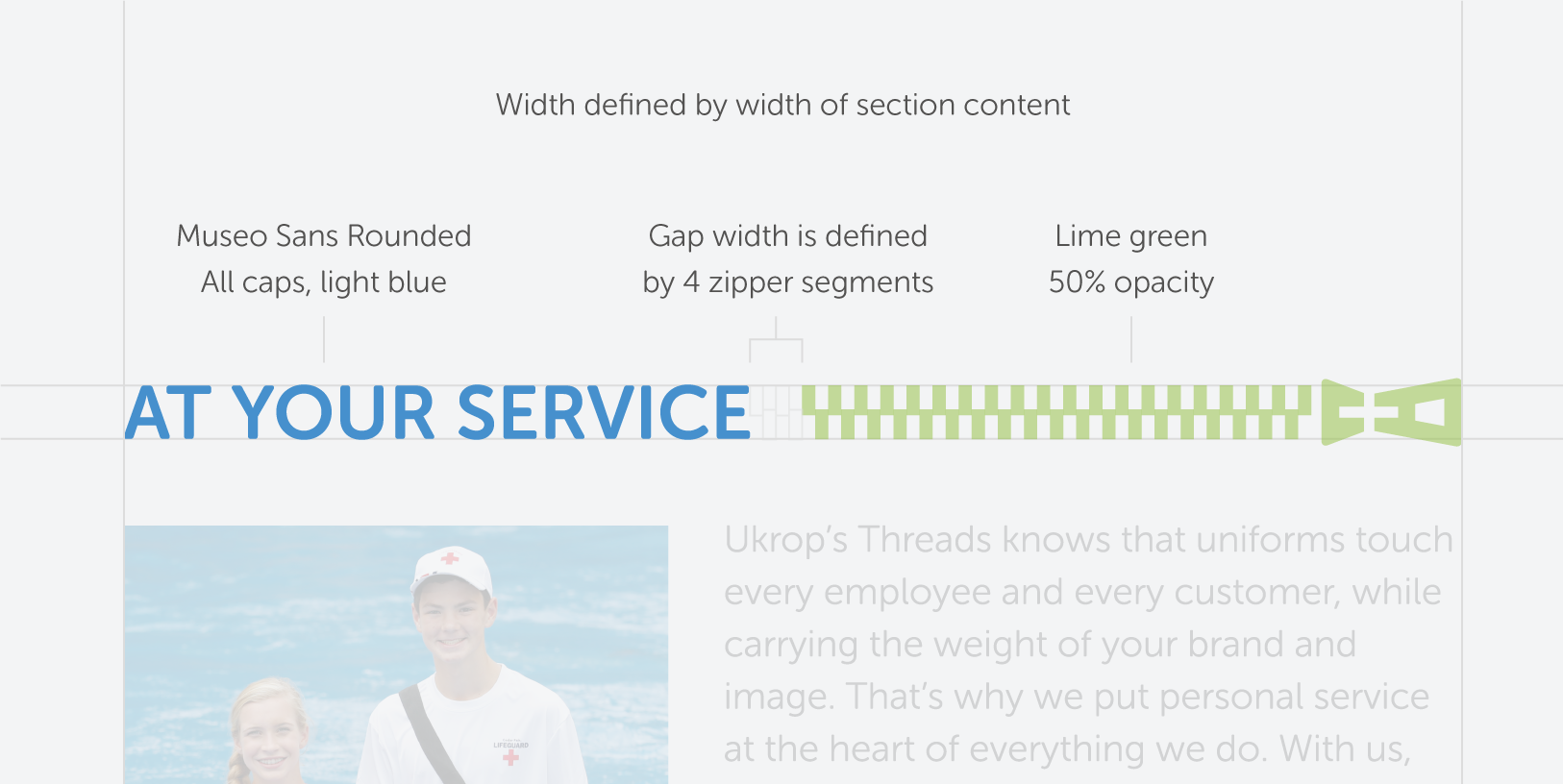
At your service.
Ukrop’s Threads knows that uniforms touch every employee and every customer, while carrying the weight of your brand and image. That’s why we put personal service at the heart of everything we do. From on-site consultations so we can fully understand your business, to customized web stores designed just for you, we are dedicated to providing peace of mind throughout the process of buying uniforms. You’ll get everything you expect—great quality, smart value and reliable delivery—plus the personal service you deserve, from our team of dedicated professionals. It’s our promise that Ukrop’s Threads will do everything possible to exceed your expectations, from the first “hello” to the last button on your shirt.
Voice and Tone
Sometimes it is not what you say, but how you say it. These personality traits and behaviors strengthen your reputation.
Follow these rules to ensure your brand is talked about in a consistent manner.
Our Name
Always refer to Ukrop’s Threads using the full name.
Never use UT or any other acronyms when referencing Ukrop’s Threads.
If necessary for spacing restrictions, you may use Threads, but only if the full name cannot be used.
Elevator Pitch
At Ukrop’s Threads, we manage end-to-end uniform programs for food retailers, theme parks and convenience stores. Our team of professionals deliver excellent customer service from start to finish, providing clients with budget-friendly custom manufacturing along with quality control, on-time delivery, specially-designed web stores and even invoicing options.
Example Headlines
Rest easy. We’ve got your back.
Uniform programs that fit you to a ‘T’.
Service that’s really buttoned up.
Service that’s buttoned up.
Consider us part of the fabric of your team.
Consider us the fabric of your team.
The fabric of your team.
Personal service is woven into every one of our uniform programs.
Personal service woven into every uniform.
Personal service woven into every uniform program.
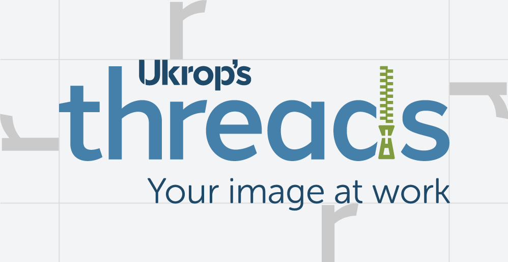
Your logo should always be placed consistently so that it is easy to find. Start by ensuring appropriate space around the logo–it should never be lost amongst other logos or graphics. Following these minimum clear space guidelines will ensure clarity and legibility of your mark.
Keep at least an r’s worth of negative space between the logo and other elements.
Never use the logo at dimensions smaller than the specified minimum size.
Logo Clear Space
Minimum Sizes
Placement
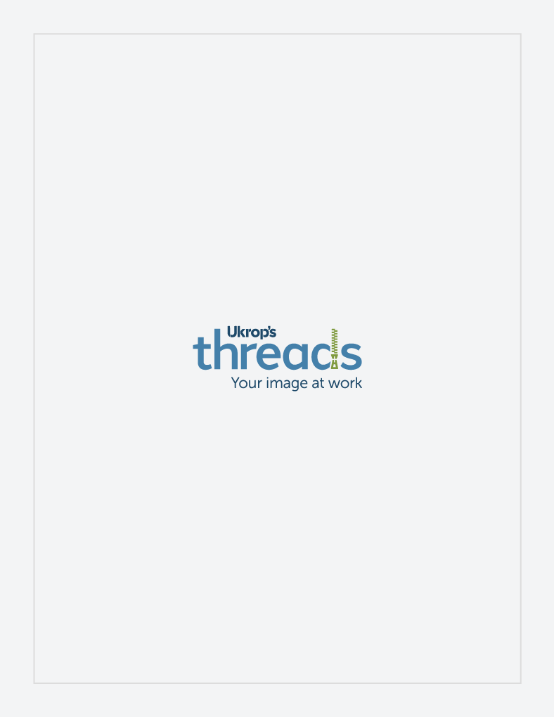
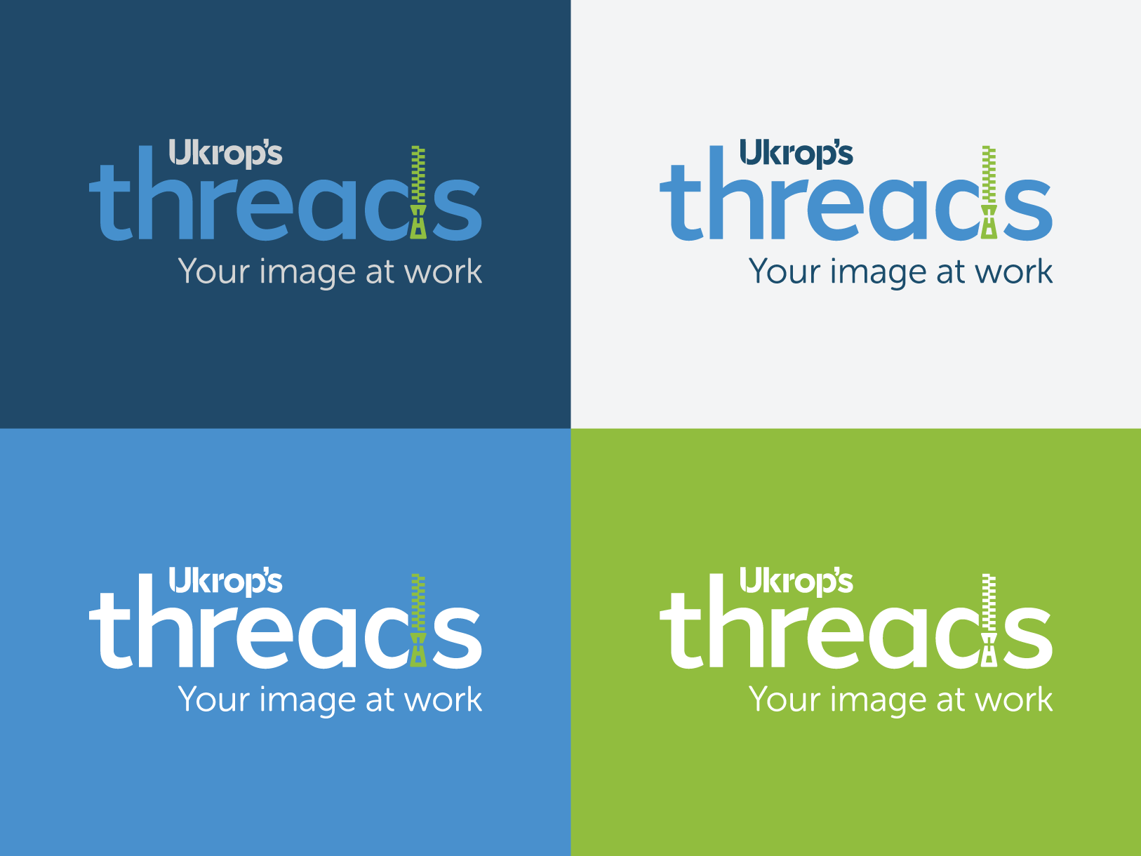
The Ukrop’s Threads logo should either appear in the center of a piece or in one of its four corners.
Corner Placement
Central Placement
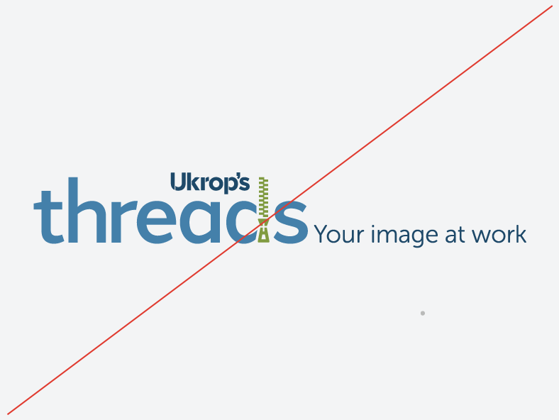
Logo Don'ts
Only use the approved and provided logos. These can be downloaded by clicking the Download Assets button to the left. Never alter the logo files. Do not add shadows, patterns, intricate backgrounds, or other effects.
Don’t change the color of the logo.
Don’t rotate the logo.
Don’t distort the logo.
Don’t re-typeset the logo.
Don’t place on a background with insufficient contrast.
Don’t create additional lock-ups.
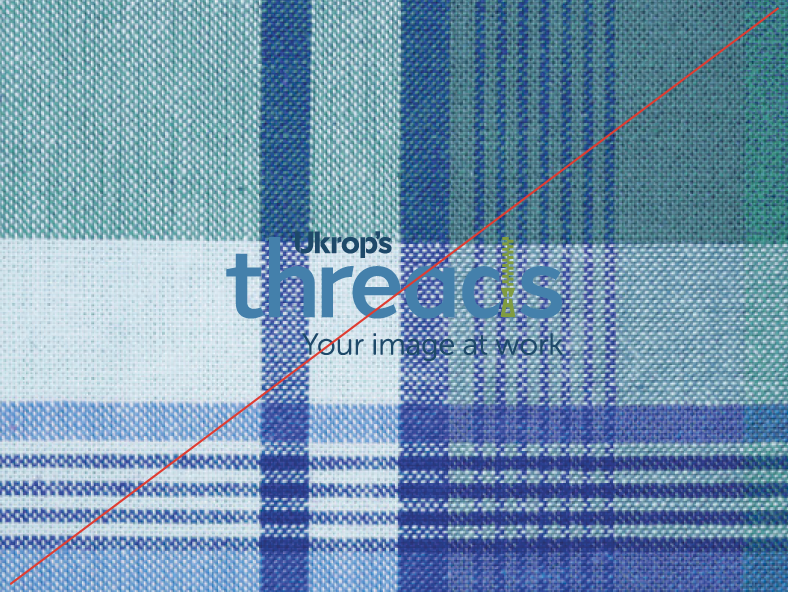
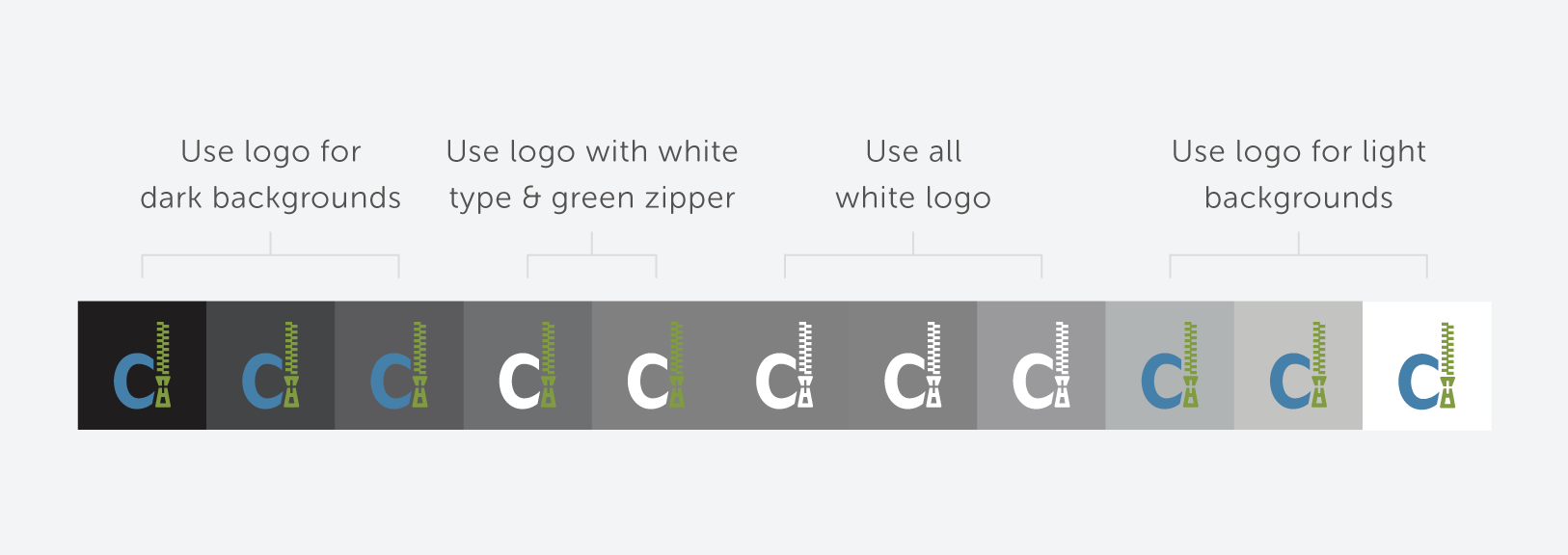
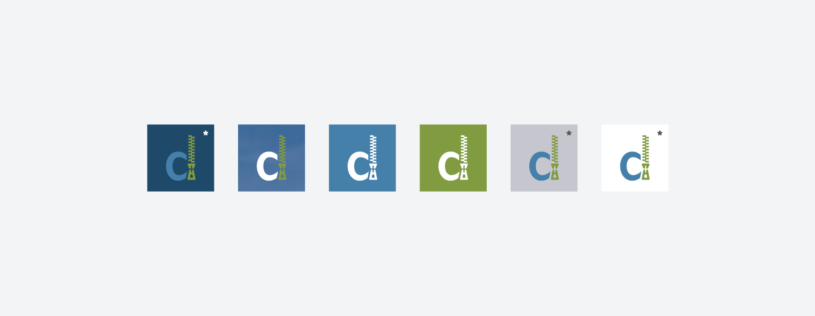
Background Contrast
Selecting which version of your logo to use can be tricky. Use this spectrum to help you decide which will provide the most contrast. Some trial and error may be necessary.
The recommended background colors for your brand are dark blue, light blue tint and white. For specific values, see Color.
Contrast spectrum
Background examples
Color
Ukrop’s Threads has a family of colors that are used to represent the brand.
Swatches
Color consistency across all brand materials is key. Here’s what you need to know.
Use Pantone values when color consistency is imperative. Use coated (C) values for glossy paper and uncoated (U) values for matte paper.
Use CMYK values for typical printing. CMYK is often more economical than Pantone, but can be less consistent across printing processes.
Use RGB & Hex values for digital use like websites, screens and projection.
White and navy should account for the majority of a given brand application. The light blue and primary green are supplemental colors.
Typography
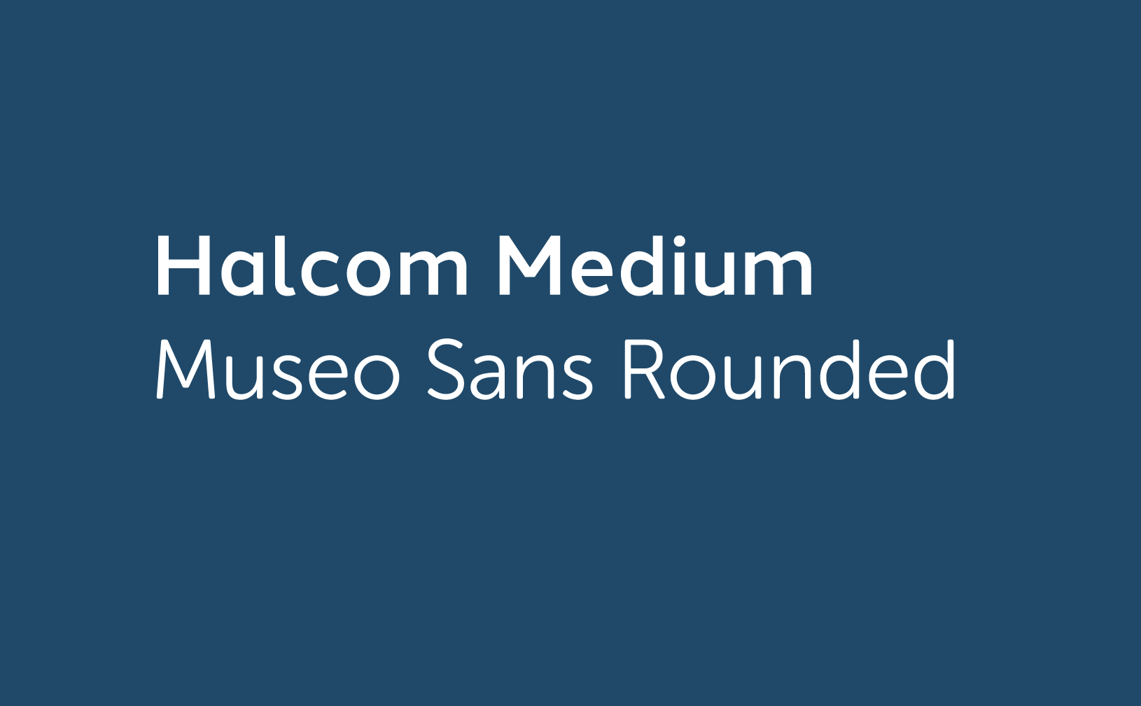
Halcom Medium and Museo Sans Rounded are the typefaces that should be used on all materials from business cards to signage.
Halcom Medium is a modern, geometric sans serif that exudes confidence and trust. Museo Sans Rounded is a low contrast sans serif that feels open, friendly and sensible.
Museo Sans Rounded—AaBbCcDdEeFfGgHhIiJjKkLlMmNnOoPpQqRrSsTtUuVvWwXxYyZz 0123456789.,;:(?&@$#)\
Type Hierarchy
The size of your font will vary across applications, but here are some general rules:
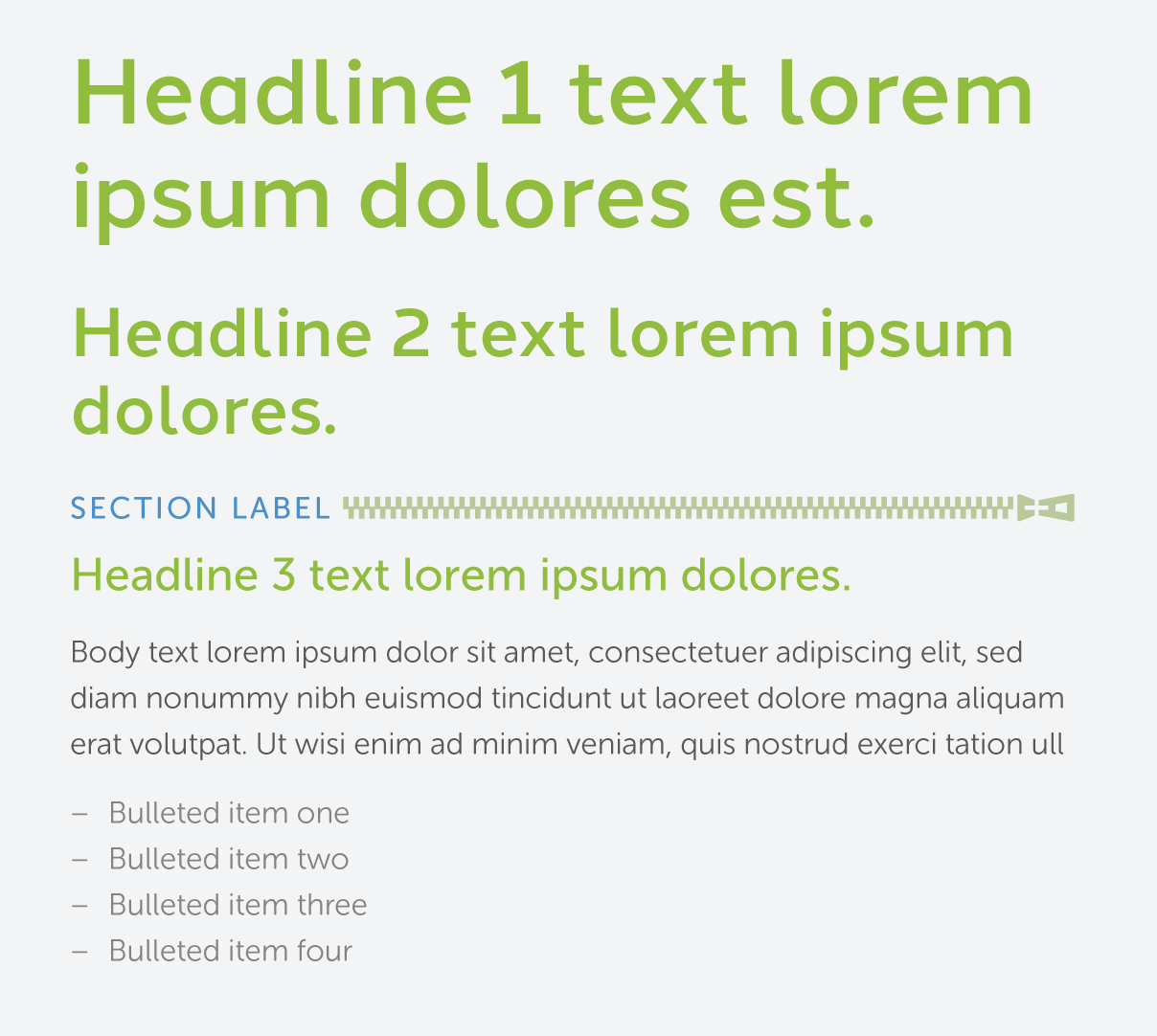
Headlines are best set at 18pt or larger. They should be noticeably bigger than body text. Headlines will be the largest text in a composition. They should be short and important. All headlines should be formatted in sentence case (capitalizing only the first word and ending with punctuation).
Section start labels (used to signify the beginning of a new grouping of content) are set in blue. They should be in all caps and the same size as the body text. Each section should be accompanied by a horizontal zipper — this creates a divide between the section label and the body text. Only use section start labels as needed.
Body text is best set between 7pt and 19pt, with care given to legibility. There should be a generous amount of spacing between each of the lines (also known as leading) for easy legibility. Body text should be noticeably smaller than the headlines.
Lists are set at the same size as body text and are slightly indented. Bullets are indicated with a single en-dash.
Sample Settings
Our Websafe Typefaces
There are some limitations when it comes to applying your brand typefaces on digital platforms. When working with HTML applications like email, there are some limitations.
Whenever you are unable to use Halcom Medium for headlines, use Arial. Arial can also be used in place of Museo Sans Rounded for body text and captions.
Some headlines highlight key words in a secondary color. Use this technique sparingly and only when headlines are lengthy or conversational.
Highlighted headline example
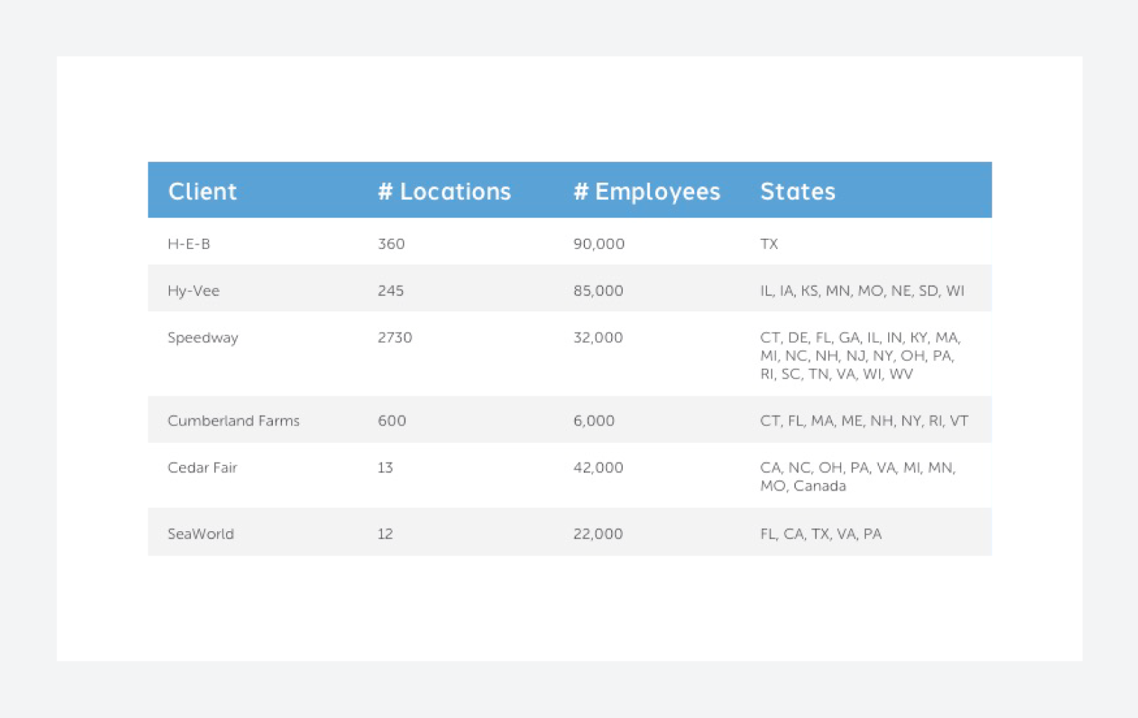
Table formatting
Use the following as a reference when formatting tables.
Table example
Graphic Elements
This section highlights the graphic elements used in your visual style. Each element often comes with a set of rules, so be sure to take note. If you have any questions, reach out to sharon.kessinger@ukropsthreads.com.
Our Photography
Photography should be candid, relatable and support the associated copy. Select images that reinforce our positioning statement, voice and tone.
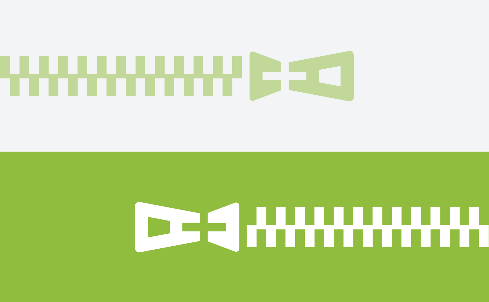
The Zipper
The zipper can be used in two ways: reversed out in a green bar or in conjunction with a label to indicate the start of a new section.
Do not use a green bar zipper and a section start zipper on the same surface.
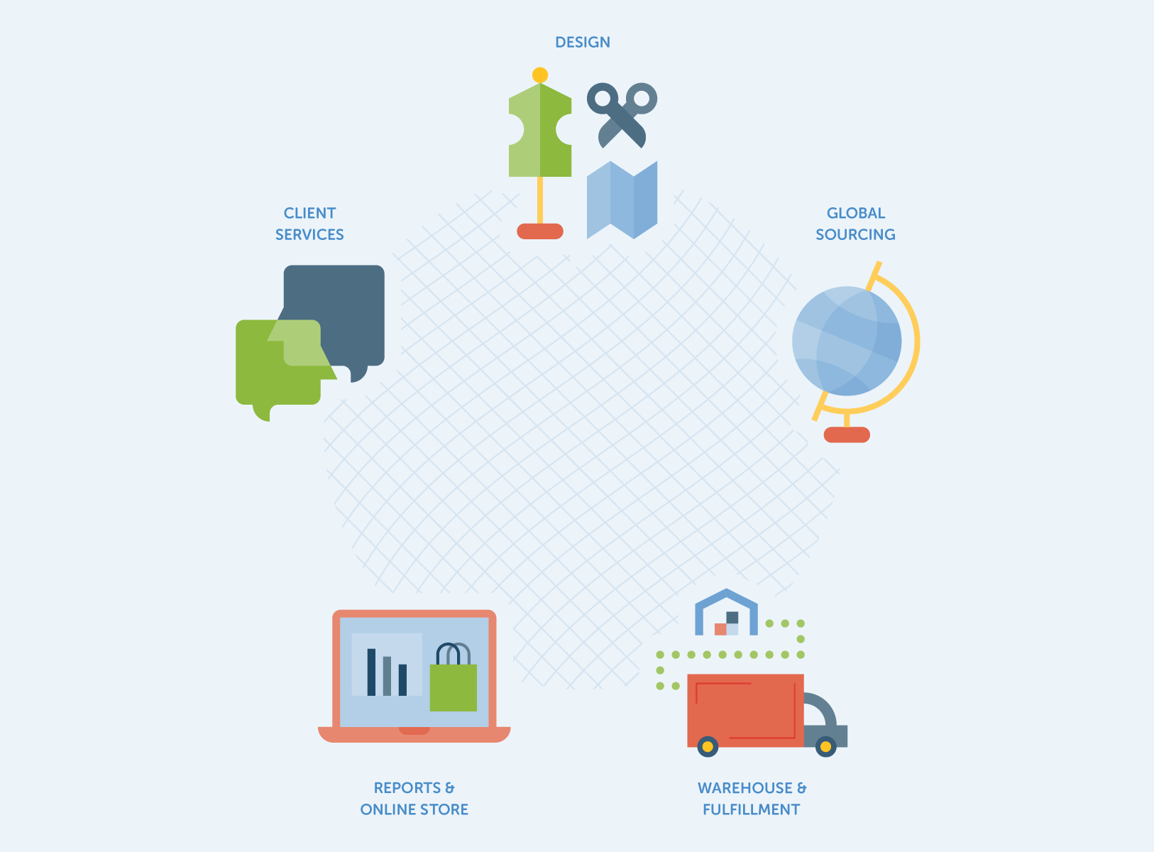
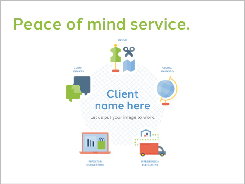
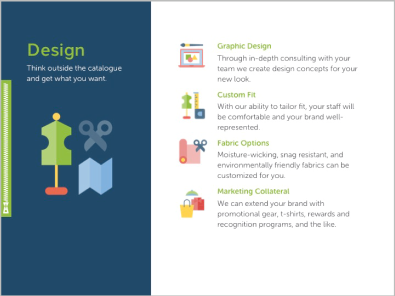
We use illustrations to help us communicate different facets of our process, capabilities and services. The illustrations are simple shapes, and are colored using tints from our brand palette. Be sure to place illustration files on a solid background with ample clear space.
Customer Satisfaction
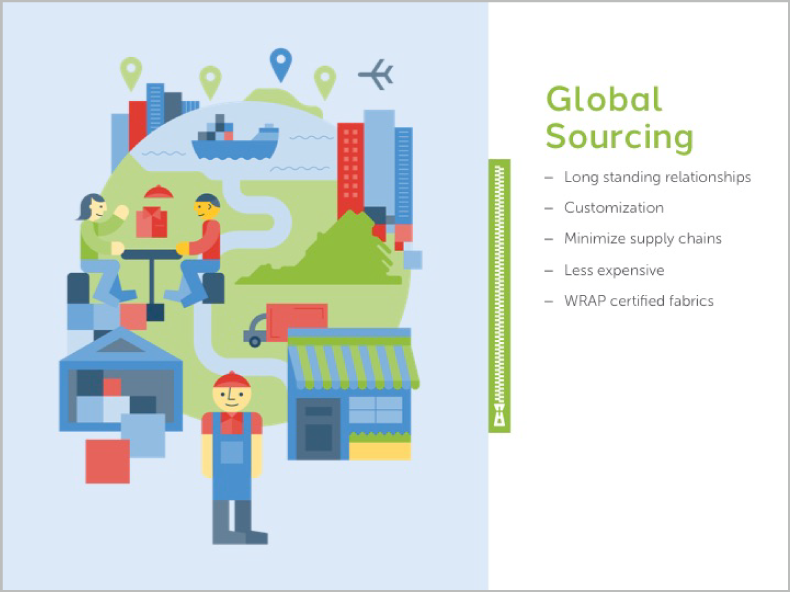
Global Sourcing
Design icon
Global Sourcing icon
Warehouse & Fulfillment icon
Reports & Online Store icon
Client Services icon
Call to Action
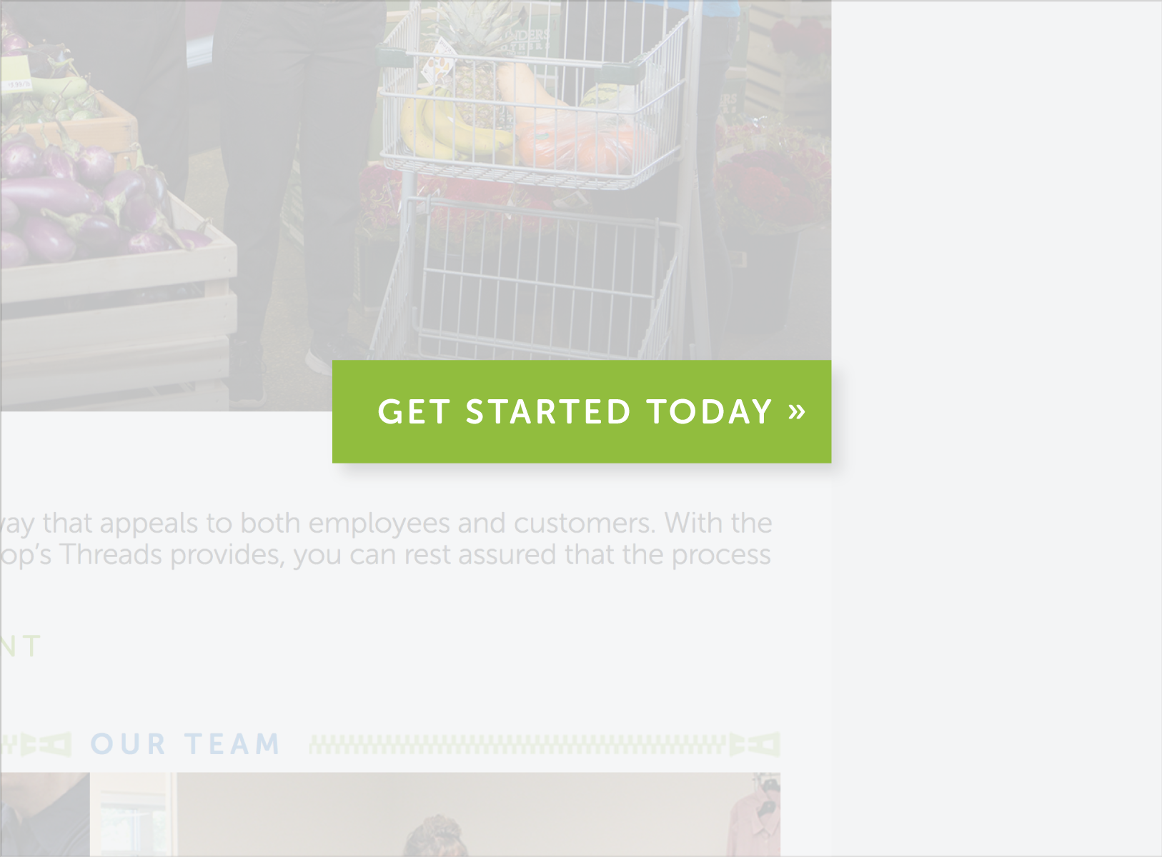
A call to action is a short imperative that encourages the reader or user to take an action. Indicating call to actions consistently will help guide your audience through materials.
Your call to actions are highlighted by a green bar with white text overlaid.
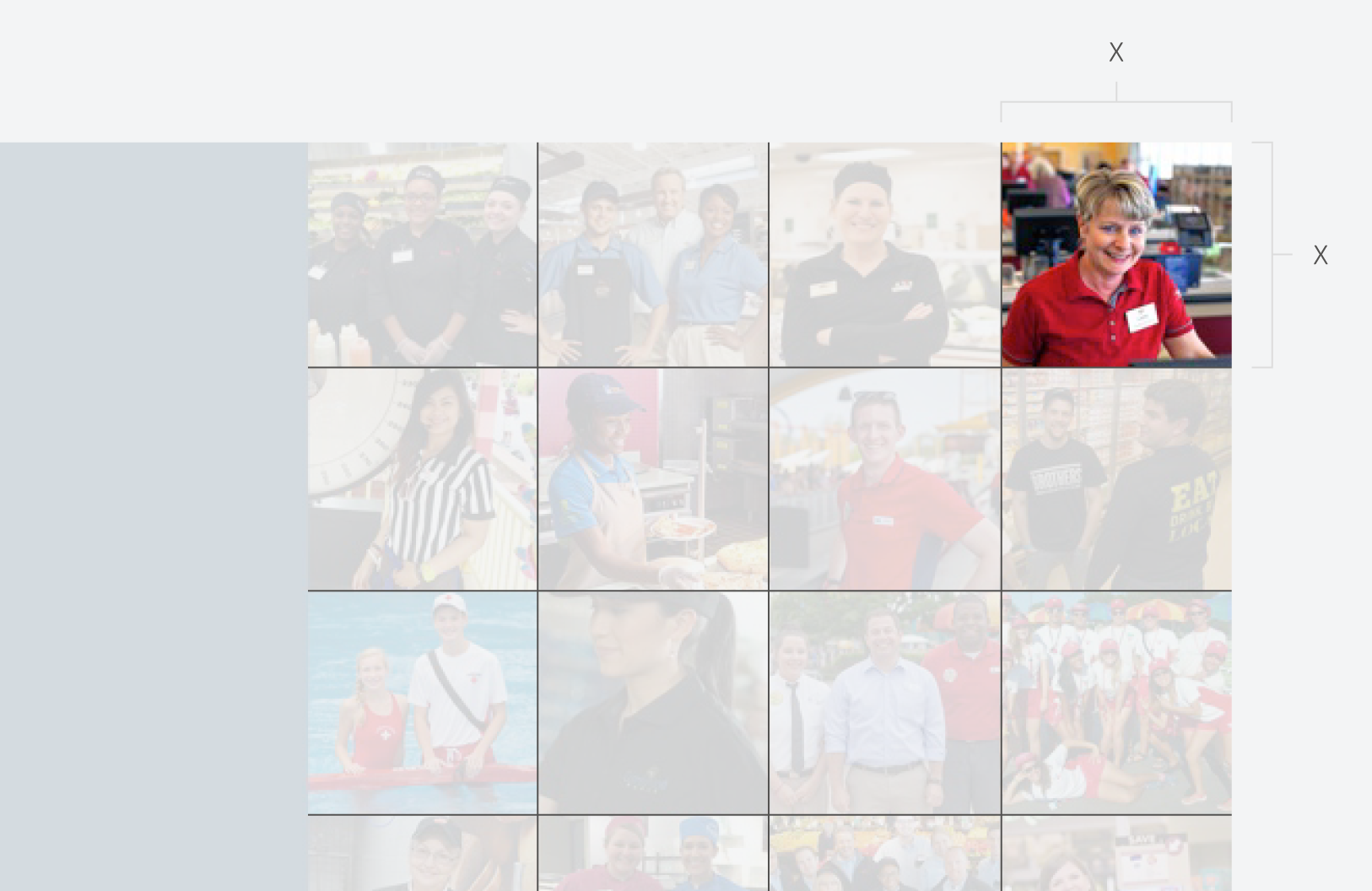
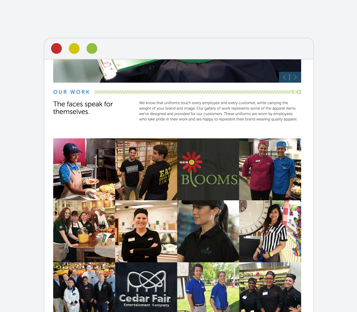
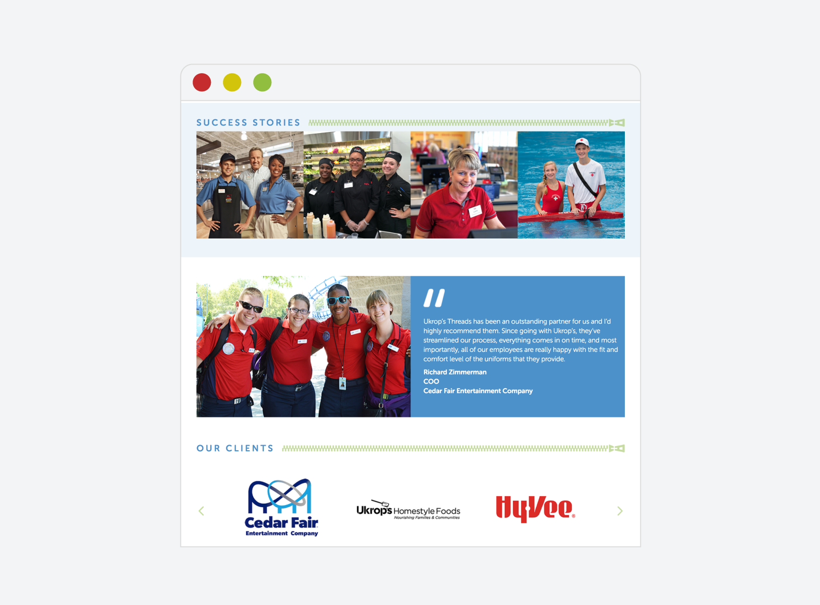
Photo Mosaic
A grid of square photos is used to showcase work or client logos.
Do not use this convention for any other type of content.
Mosaic Anatomy
Mosaic Example
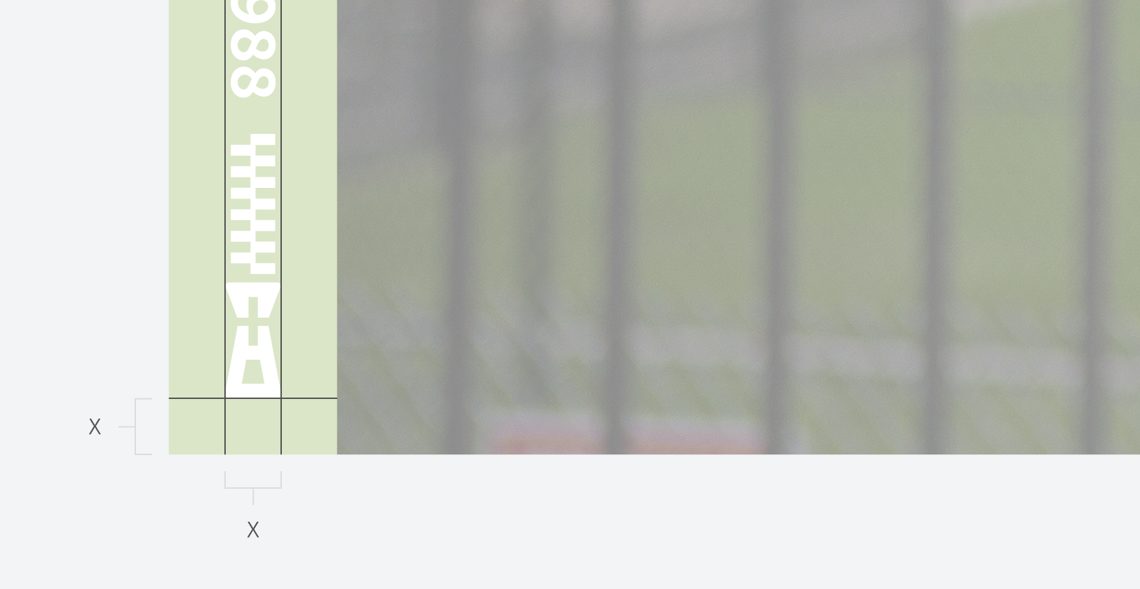
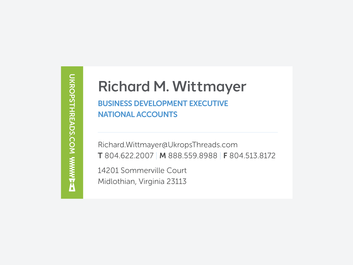
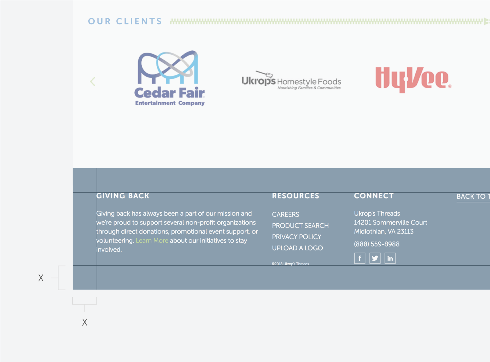
Footer
The footer contains contact and copyright information and occasionally the logo. It is at the very bottom of applications.
Footer Anatomy
Footer Example
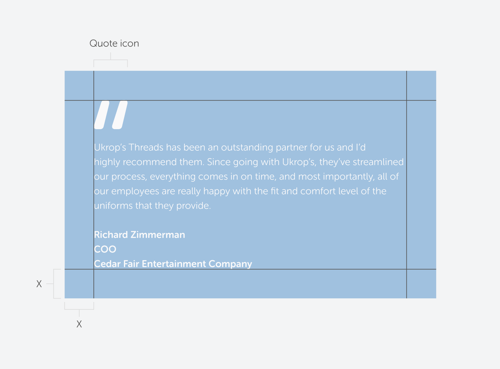
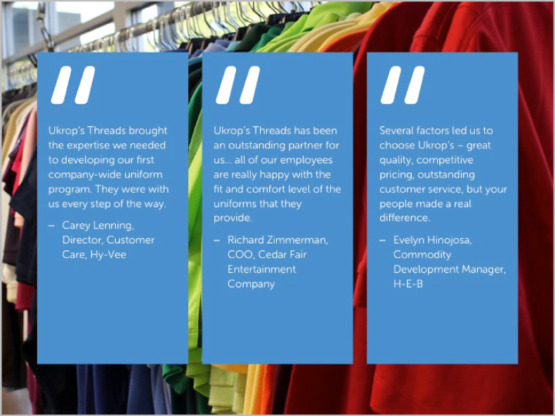
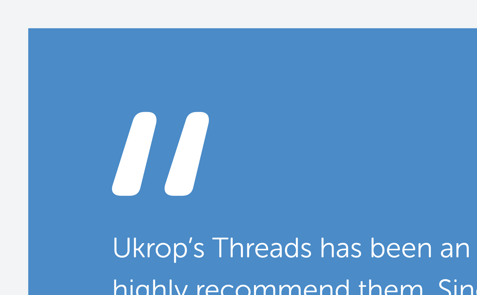
Testimonial
Testimonials are always set in a blue box with white text overlaid. The quote icon begins the testimonial.
Our Powerpoint presentation is a tool for communicating clearly and persuasively with potential clients. Since this is often the first interaction with Ukrop’s Threads, it is important for it to maintain consistency so that it is an accurate introduction to the brand.
Unique Layouts
These slides have been designed to accommodate specific types of content. They will rarely vary from presentation to presentation.
All slide templates are accessible in the Layout menu. Do not change any master layouts.
Any new or specialized slides should use the existing master layouts as a foundation.
Do not make your own graphics or alter graphics that already exist.
Title
History
Customer satisfaction
Design process
Testimonial
Global sourcing
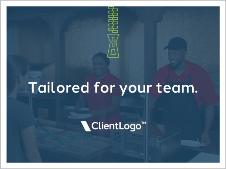
Title Slides
Title slides have a variety of backgrounds that can be used depending on your audience. Your options are accessible in the Layout menu.
Be sure to replace the placeholder logo with the appropriate client logo. An all white logo is ideal, but any logo that has a sufficient amount of contrast with the background will work. Keep it small and centered as is demonstrated by the placeholder.
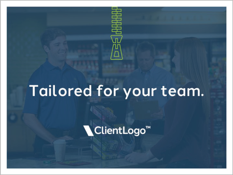
Convenience
Grocery
Fast casual
Amusement
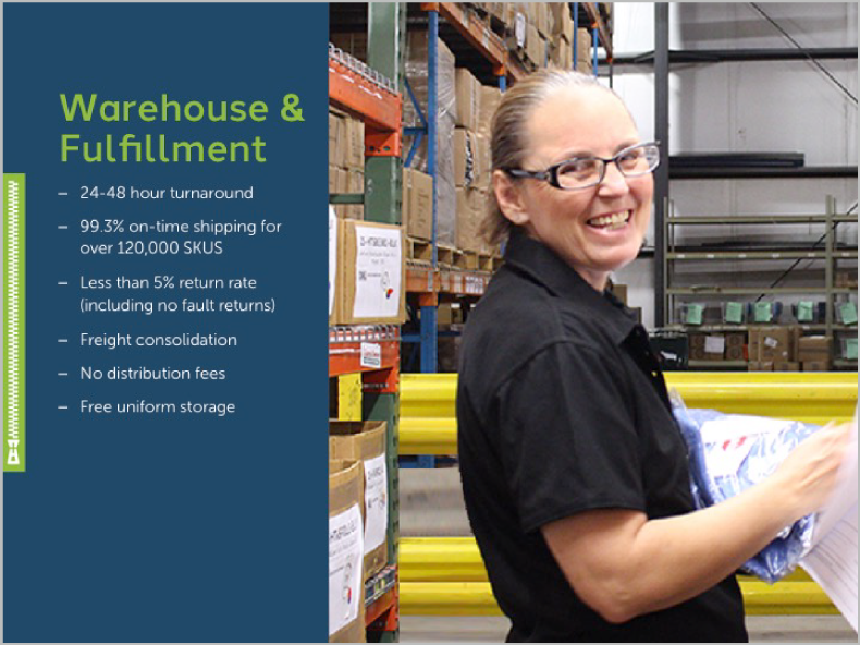
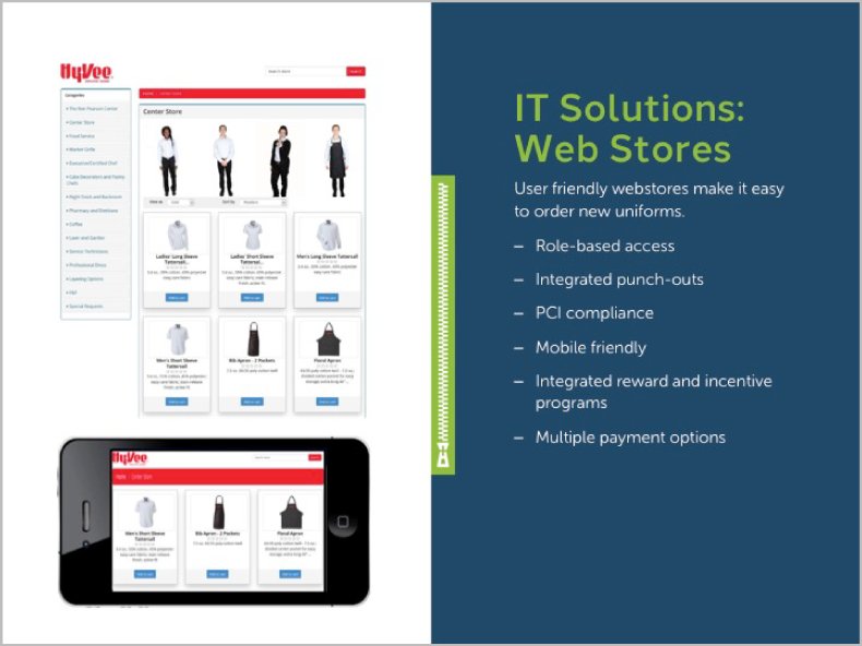
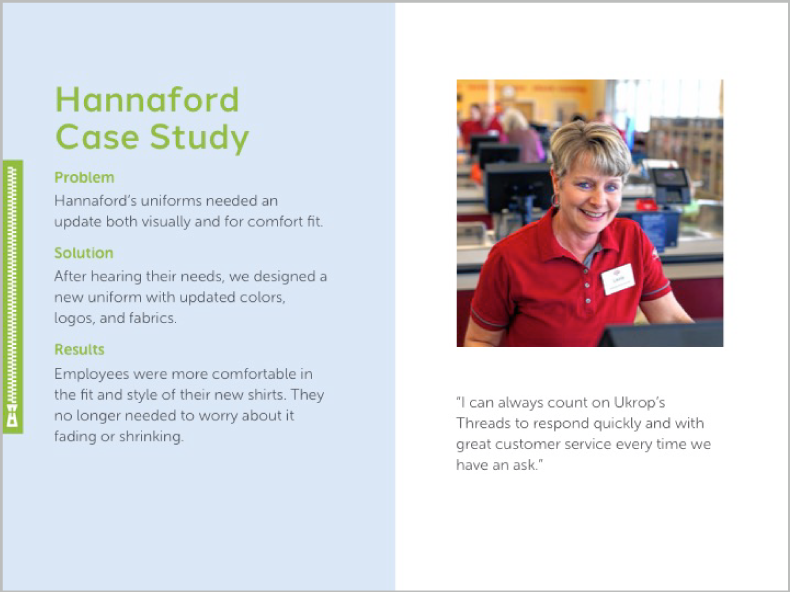
Body Layouts
Body layouts consist of two zones: one for copy and one for imagery or supporting graphics.
When the body copy is minimal, supporting visuals can be larger (see Third-width navy background). When your body copy is substantial, supporting visuals may be eliminated completely (see Full-width navy background). All slide templates are accessible in the Layout menu. Do not change any master layouts.
Any new or specialized slides should use the existing master layouts as a foundation. Do not make your own graphics or alter graphics that already exist.
Third-width navy background
Half-width navy background
Half-width light blue background
Full-width navy background
Typography
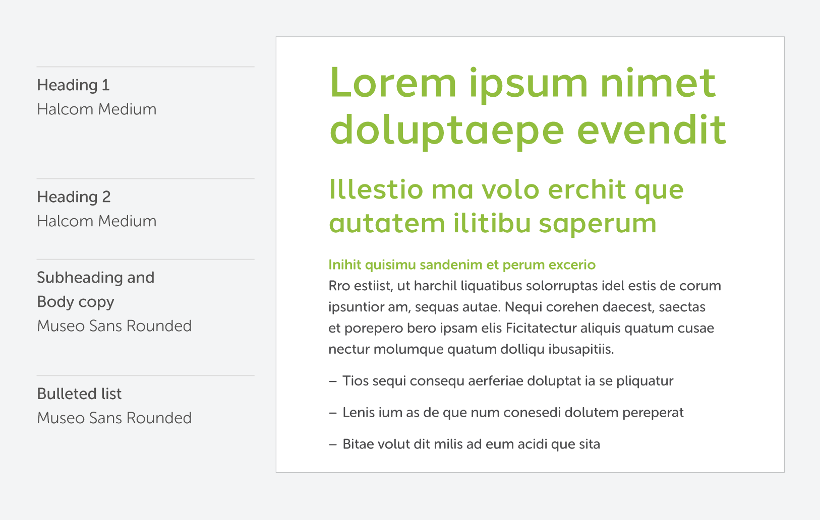
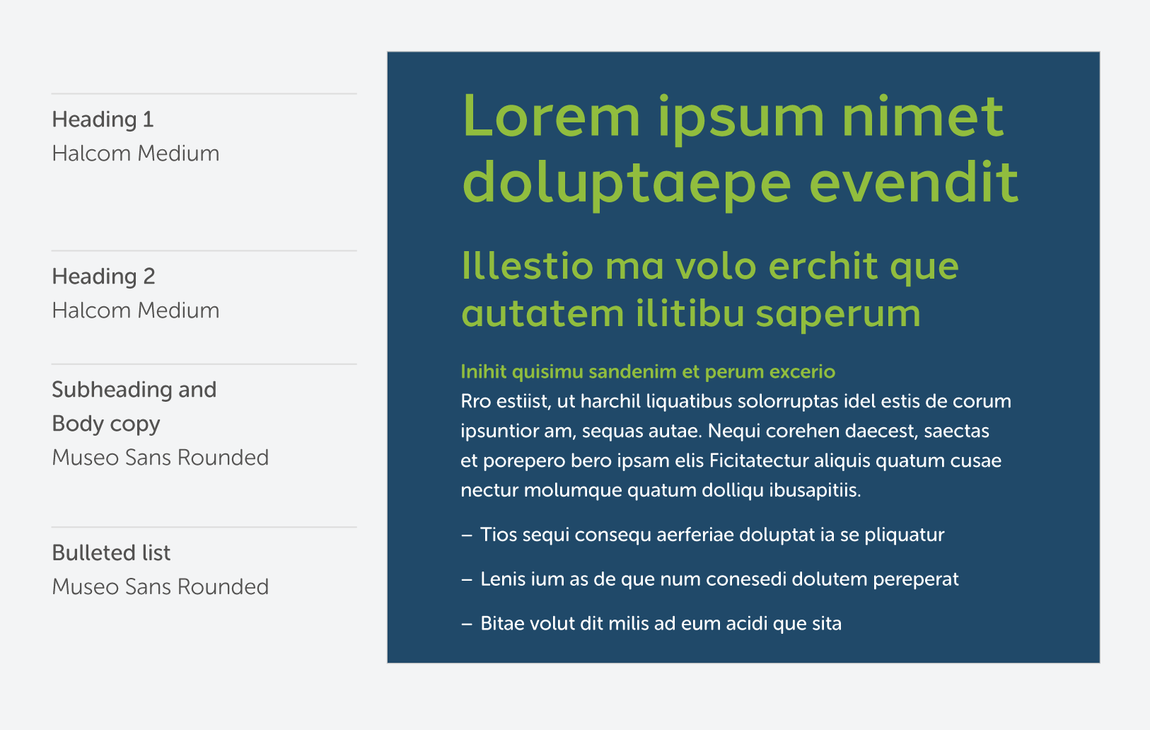
Heading 1s are used on the title slide and on slides with very little copy to drive home important points.
Heading 2s are commonly used as the title format on body layouts. They can also be used on slides with minimal copy to drive home important points.
If the title of a slide is a noun, capitalize each word (typically 1-3 words). If the title is a phrase, capitalize the first word only and end the phrase with a period.
Subheadings are used in conjunction with body copy. Use them to break up the copy into discrete, digestible sections. Depending on the nature of the content, subheadings are not always necessary.
Use body copy for normal running text, and bulleted lists for short, connected and consecutive items.
Light background
Dark background
Tips
Start fresh.
A new presentation should always begin with the master presentation template. Do not repurpose a previously used presentation.
Adjust client-specific information.
The title and customer satisfaction slides have areas where custom information must be entered.
Create rhythm.
Vary body layouts. For example: use a left-positioned background, followed by a right-positioned one, followed by a full width layout. This prevents monotony and helps sustain interest.
Less is more.
Keep content as concise as possible. Information on slides should be high-level and serve as a jumping-off point for natural speech and conversation. When possible, select and hide slides based on each specific audience.
Keep things scannable.
Try to chunk information into bite-sized pieces. Break separate thoughts into separate paragraphs.
Dont overload bulleted lists.
Keep bulleted lists to 6 items. Try not to have a single item exceed a length of two lines. Capitalize the first letter of each bullet but do not include periods.
Use spell check.
Always.
Asset Downloads
Here are the key assets to the Ukrop’s Threads’ brand. Whether it is your first time reviewing this Brand Suitcase or the 30th, it is always smart to revisit the rules and recommendations for the specific files you are downloading. Keep in mind, this platform will continually be updated as the brand progresses — so be sure to check back with each new project.